
Between Input and Insight: The summaery2026 Design
From 9 to 12 July 2026, the University campus and the city area will once again transform into a venue for exhibitions, discussions, and encounters. Students and instructors from all departments will be presenting their projects, ideas, and research findings from the past academic year during summaery2026. This year, the Faculty of Media is taking the lead and has devised the theme: »prompt‽«. The term is now typically associated with artificial intelligence, but its meaning extends far beyond that: it is a call to action, a catalyst for new ideas, and a starting point for creative processes. The interrobang »‽« combines a question mark and an exclamation point and expresses curiosity, urgency, experimentation, and reflection.
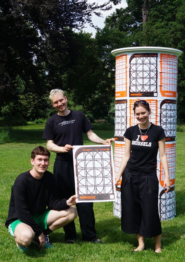
But how can this be expressed in graphic form? We spoke with Bachelor’s students in Visuelle Kommunikation (Visual Communication), Ames Grund, Hannes Altmann, and August Guccione, who created the design for summaery2026. In our interview, they explain how they translated »prompt‽« into a visual language, what the thought process was behind the design, and what they’re most looking forward to at this year’s annual exhibition.
What does the »prompt‽« theme mean to you, and how did you interpret it from a design perspective?
Despite the term’s dual meaning, we of course had to consider the interface with artificial intelligence first and foremost. AI has had become so unbelievably relevant in the news, media, and everyday life in recent years. When people hear the word »prompt«, they inevitably think of the user interfaces of popular language models – all of which look very similar. For us, it was clear from the beginning that we didn’t want to reproduce this aesthetic. We wanted a fresh perspective, so we asked ourselves: What might still surprise us about this topic? What unexpected things might emerge?
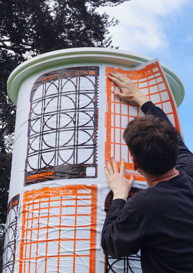
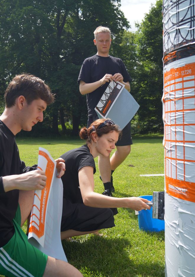
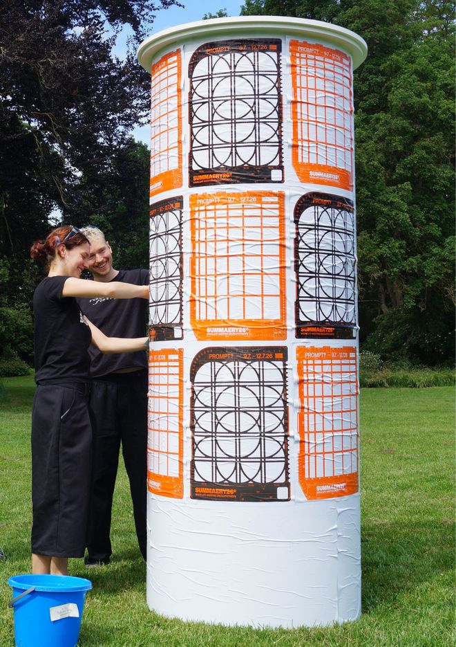
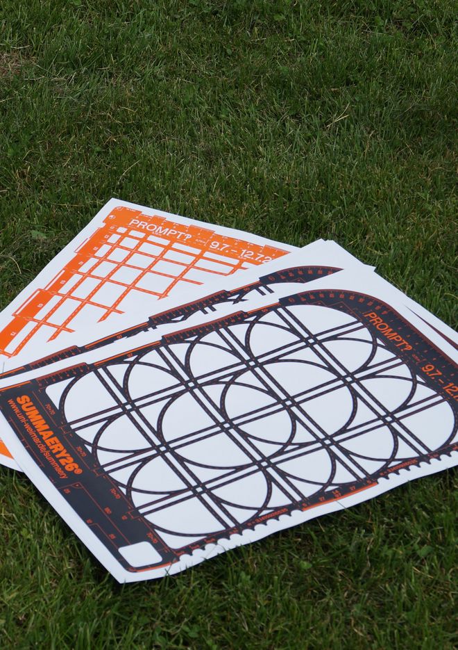
We understand the prompt, or rather the act of prompting, mainly as a tool and a craft. Based on this idea, we searched the analogue world for tools that had a generative nature, and we came across historical lettering stencils (Plaque Découpée Universelle, 1870). These can be used to »generate« entire typefaces. Including letters and numbers, from a single stencil. This fit our purposes perfectly because prompting relies on language, and the visual representation of language is writing. What we did was we designed two stencils of our own for summaery, and these also served as the central theme of the posters, and we intend to use them (as a tool!) for designing additional formats.
The interrobang »‽« combines a question mark and an exclamation point in a single symbol. How does is this tension expressed in your visual design?
Our analogue, physical approach deliberately contrasts with what people might initially associate with the »prompt‽« theme. Digitality, terminal aesthetics, code fragments or symbols, monospace fonts, and so on. Our posters feature photos of real objects. Both stencils are laser-cut from plexiglass and were photographed in a photo studio. During the design process, we also decided against using AI, even though it would have been an obvious choice given the theme. In our opinions, these decisions all contribute to a sense of ambivalence in the content, just as the interrobang itself implies.
Today, prompt refers to the interface between humans and artificial intelligence. What role did this play in your design?
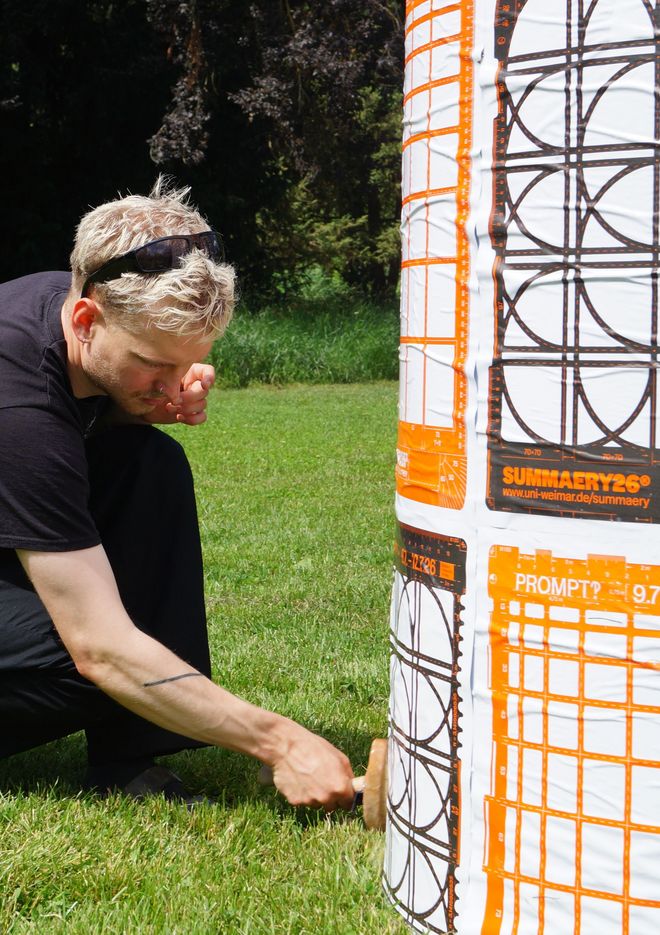
»Interface« is a very abstract digital term. We think our physical stencils make the concept a bit more tangible as an analogy. They serve as analogue interfaces that divide the inside from the outside between input and output. The stencil has cutouts that essentially function as input fields prompting the user to provide input. Much like a prompt, a single stencil can generate countless possible results. At the same time, the stencil naturally sets limits: Much like a design stencil, a prompt establishes boundaries and reference points. Deliberately choosing the words determines what is emphasised and what is excluded.
How did you progress from the motto to the finished design? Were there any specific experiments, inspiration sources, or surprising discoveries?
At the very beginning, we created a Miro board where we could all add our inspirations and references. At that point, we were still exploring which direction to go in. One of our ideas, for example, was to create a poster completely by hand and print it using letterpress. We actually even made test prints for this idea at the Pavillon-Presse Weimar. Ultimately, however, the Faculty of Media decided on the stencil idea. The inspiration for this came from architectural stencils from the 1970s, which were used as aids for manual technical drawings.
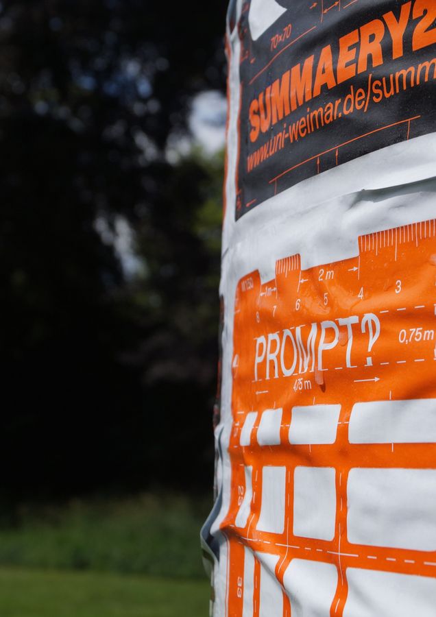
We found the stencils—as objects without any design ambitions—incredibly exciting, especially their secondary layer with all the small labels, lines, and arrows. We adopted this technical aspect as a design element to hint at the complexity hidden behind the otherwise sleek prompting interfaces. We also drew inspiration from the 1970s stencils when it came to colour. The warm orange is perfect for summer, and when paired with black, it is reminiscent of a well-known hardware store chain. We took advantage of this to further reinforce the tool-like concept.
Finally: What are you personally most looking forward to at summaery2026?
At the end of this semester, a true legend is leaving us: Marcel Saidov, artistic staff member at the Professorship of Typography and Typeface Design. We are looking forward to toasting him together at summaery. We’re also really excited about the typography exhibition and the release of this year’s PORT magazine.
Thank you so much for the discussion!
The interview questions were asked by Luise Ziegler.
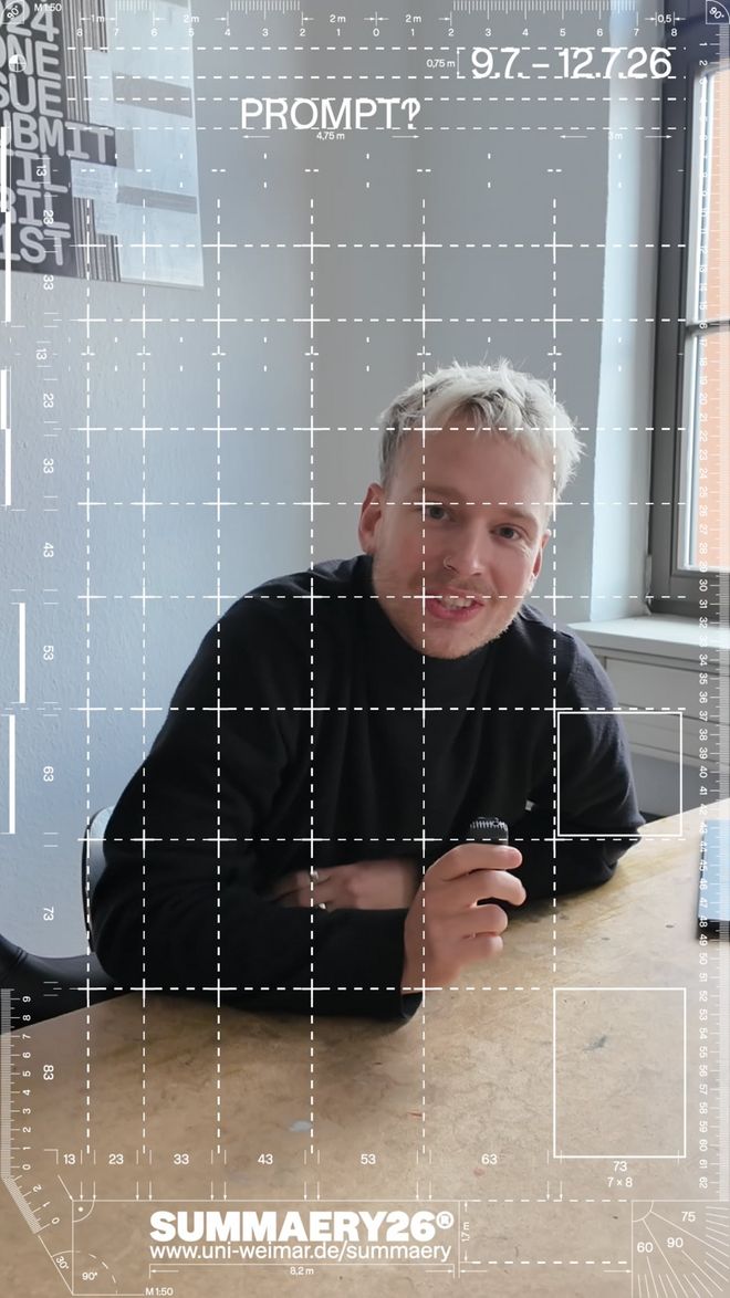
Teaser summaery2026
Click the Play button to load and view external content from Vimeo.com.
Automatically load and view external content from Vimeo.com (You can change this setting at any time via our »Data protection policy«.)