


»An invitation to take a closer look«: about the design concept for the summaery2025
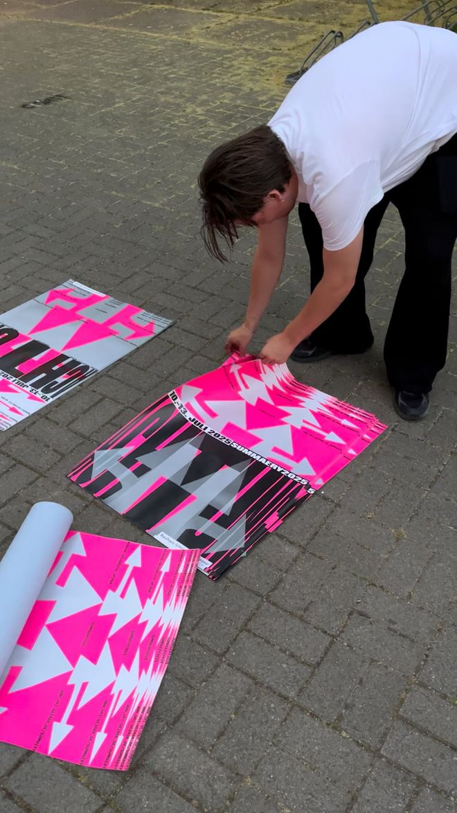
The motto of this year’s summaery is »ACHTUNG« – the German word for »attention« or »caution«. It isn’t only a word of warning, though, but also alerts us to new things that are emerging and to a respectful and mindful interaction with one another. This year, the Faculty of Art and Design is responsible for organising the summaery and therefore also for developing the motto and design for the annual exhibition. The concept and visual idea for the summaery were conceived by Professor Burkhart von Scheven and Masihne Rasuli from the Chair for Visual Communication. The two Visual Communication students Mona Lea Kerntke and Leonard Behre developed the graphic design for the event posters, programme booklet and social media. They explain in this interview how traffic signs became design elements, why the design is loud and direct, but not discouraging, and why the town will light up in neon pink and silver.
What does the motto of this year’s summaery »ACHTUNG« mean for you?
Mona Lea Kerntke: Particularly in the transport context, the German word »achtung« can often have negative connotations. We want to change this, especially for the summaery. »Achtung« is not just a warning, but also a call to action. Our design is loud and direct, but not discouraging – rather, it is an invitation to take a closer look, to remain alert and to redirect our gaze.
How did you incorporate the motto into your design?
Leonard Behre and Mona Lea Kerntke: Elements from the roadscape and traffic infrastructure formed our starting point – in other words, precisely where »achtung« often becomes visible and directly tangible in everyday life: in road markings, signs, escape routes and reflective materials. We were inspired by the aesthetics of stretched road markings – lettering and arrows that appear normal to drivers when travelling at high speeds that are actually greatly distorted. We draw on this principle in our design. Stretched typography and arrows within a clear grid create rhythmic repetitions and a kind of visual appeal that automatically directs the eye. We opted to use neon pink and silver to round the whole look off with a corresponding colour scheme so that it also attracts attention from afar.
Is there anything special about your design that you’d like to share with us?
MLK and LB: We developed a flexible system for use across different media – whether print, online or animation. It was important to us that the design doesn’t appear static, but leaves room for flexibility and is also fun. Neon pink and silver create strong contrasts and overlapping these adds captivating overlays, a feeling of depth and shimmering light reflections.
What do you both definitely not want to miss at the summaery2025?
LB and MLK: It’s the first real summaery in Weimar for Mona and a very special one for Leonard – so we’re looking forward to the exhibitions and the atmosphere on campus all the more and definitely the release of the latest issue of PORT. And the moment when we see the finished products for our own project, of course – when everything comes together and the city lights up in neon pink and silver. Concept and visual idea for the graphic design for the summaery2025: Professor Burkhart von Scheven Masihne Rasuli Graphic implementation: Mona Lea Kerntke and Leonard Behre, with support from Professor Burkhart von Scheven, Masihne Rasuli and Adrian Palko Animations: Lorenz Weiland
summaery2025 Plakate
Click the Play button to load and view external content from Vimeo.com.
Automatically load and view external content from Vimeo.com (You can change this setting at any time via our »Data protection policy«.)