Abschlussarbeit »Es hat mal wieder geklappt« von Paul Stolle

Konzertreisen von Gewandhausmusikern zu Zeiten der DDR

ein Buch von Paul Alexander Stolle

Reisen ist heutzutage etwas Selbstverständliches. Egal ob geschäftlich oder privat, ob in die Nachbarstadt oder auf die andere Seite der Erde — wir können jederzeit aufbrechen in die Ferne. Doch diese Zeit der unbegrenzten Möglichkeiten ist noch keine dreißig Jahre alt. Vor der Wiedervereinigung war es nur einem Teil der Deutschen vorbehalten, die Welt zu bereisen.

Die Musiker des Gewandhausorchesters Leipzig gehörten zu den wenigen Privilegierten, die dank ihrer Profession die DDR zeitweise verlassen durften. Auf zahlreichen Tourneen bereisten sie die unterschiedlichsten Länder. Ihre persönlichen Erinnerungen und Erfahrungen spiegeln die unglaubliche Reisegeschichte des ältesten bürgerlichen Konzertorchesters Deutschlands wider und erlauben zugleich einen Blick in das professionelle Musikerleben. Umrahmt von Bildern und Zeitdokumenten entsteht die subjektive Reisecollage einer bald vergessenen Zeit.

Weitere Informationen unter paulstolle.com


Abschlussarbeit »Somehow there…« von Samuel Solazzo

»Alle Fotografien sind eine Art Reise und ein Ausdruck von Abwesenheit. […] Das Foto definiert eine Abwesenheit. Auch wenn es zehn Jahre alt ist, das macht nichts aus. Es bewahrt, es hält den leeren Raum offen, den die Abwesenheit des Abgebildeten eines Tages hoffentlich wieder füllen wird.« — John Berger

Hier und doch auch nicht. Mittelpunkt meiner Abschlussarbeit stellt das Dazwischen, ein Gefühl von Anwesenheit und Abwesenheit dar. Im Speziellen ist mein Großvater Stefano Vito Aldo Solazzo, welcher als Gastarbeiter zum Beginn der 1960er Jahre aus Süditalien nach Deutschland kam, Thema der Arbeit. Vor mittlerweile über 20 Jahren, am 17.06.1997, verstarb er im Alter von 51 Jahren. Zu diesem Zeitpunkt war ich gerade einmal vier Jahre alt. Außer einer vagen Vorstellung, welche sich aus Erzählungen sowie Fotografien zusammensetzt, besitze ich keine konkreten Erinnerungen an ihn. Meine Arbeit soll einen Annäherungsversuch an meinen Großvater als Person, meine Familiengeschichte und meine entfernten Wurzeln zu seinem Herkunftsland darstellen. Gleichzeitig steht die individuelle Geschichte meines Opas repräsentativ für die Geschichte einer ganzen Generation von Gastarbeitern. Menschen, welche ihre alte Heimat, Freunde und Familie zurückließen, um in einem fremden Land Arbeit und vielleicht auch eine bessere Zukunft zu finden. Begleitet wurden sie von Sehnsüchten und Träumen, Konflikten und innerer Zerrissenheit sowie dem Gefühl, zwar in zwei verschiedenen Kulturen zu leben, aber in keiner von beiden so wirklich zu Hause zu sein. Mein Großvater ist ein Teil dieser Generation und so auch ich.

Die gezeigte Arbeit setzt sich aus Fotografien, Collagen, analogen Drucktechniken wie einem Siebdruck und einer Cyanotypie, gefundenen Bildern, Dokumenten, persönlichen Gegenständen und Familien-Fotos zusammen.


Brno 2018

wir freuen uns sehr, dass drei Publikationen aus der Visuellen Kommunikation im Wettbewerb der Brno Biennale vertreten sind.

Seit über fünf Jahrzehnten stellt die Brno Biennale eine wichtige internationale Plattform für Ausstellungen, Diskussionen und relevante Begleitprogramme zum Thema Grafikdesign und dessen Bedeutung für die visuelle Kultur dar. Drei Publikationen aus der Visuellen Kommunikation von der Professur Grafikdesign sind nun im Wettbewerb der 28. Internationalen Biennale vertreten.


Zu den nominierten Arbeiten gehört zum einem das »PORT Magazine« von Gabriel Dörner, Lina Gräf und Nora Keilig. Ebenso im Wettbewerb ist die Horizonte Ausgabe 11 zum Thema »Wissen/Knowledge«, gestaltet von Leon Lukas Plum und Jakob Treß sowie die Publikation »SPACE FOR VISUAL RESEARCH 2«, die zweite Ausgabe des Kompendiums über experimentale Bilderzeugung, gestaltet von Enno Pötschke und herausgegeben von Prof. Markus Weisbeck, Anna Sinofzik und Adrian Palko.


Bauhaus Masters Lecture — Lance Fung

Visiting from San Francisco / New York City, Curator Lance Fung will be in Weimar to offer a presentation about his curatorial practice as well as the industry of Public Art. Fung will share some of his previous curatorial endeavors as well as upcoming projects (including NEXT100 in Weimar in 2019) through his casual and entertaining speaking style. 

Fung is known for his groundbreaking exhibitions such as ‚The Snow Show‘ which explored the parallels and differences between the Art and Architectural Worlds and ‚Lucky Number Seven‘ the 7th SITE Santa Fe biennial. We hope to see you there!

Additional Info: https://www.bauhausnext100.com/en/creating-legacy-through-ephemerality-en/

23.11.2017 VDV HP05 19pm

posterdesign: Leon Lukas Plum


Port Magazin 2017

Here it is again

Das Port-Magazin ist das studentische Magazin der Bauhaus-Universität Weimar. Die Redaktion und Gestaltung des jährlich erscheinenden Magazins liegen komplett in studentischer Hand. Das Thema diesen Jahres lautet Konsistenz. Das Bindemittel, das ein Projekt erst schlüssig macht, das Grundkonzept, um das sich alles dreht, die Struktur, die sich aus den einzelnen Komponenten ergibt und durch die eine Arbeit zum Gesamtwerk wird. Verschieden wachsen Konzepte heran, manche beginnen als ein filigranes, ganz durchlässiges Konstrukt und werden mit der Zeit dichter. Einigen liegt ein festes Gerüst zu Grunde und so manche schäumen über in einem Moment der Inspiration, in dem das Vorhaben dann sofort realisiert werden muss. Aus all diesen Umsetzungen vielfältiger Ideen, die uns angereicht wurden, wurde ein neues, konsistentes Ding erschaffen – eine sortierte Sammlung, die sich einreiht in die Schar der Vorangegangenen. Eine Port in drei Teilen: KON, SIS & TENT.

Im Sommersemester 2017 wurde das PORT-Magazin von Gabriel Dörner, Lina Gräf und Nora Keilig erarbeitet.

Die Port ist käuflich zu erwerben beim Lucia Verlag

Es gibt bereits einige Feautures der Port, einen bei Design made in Germany und einen weiteren bei Slanted.


Call for Entries: Student Poster Competition

Deadline: 31.7.17

This year, for the seventh year run­ning, the pos­ter fes­ti­val Welt­for­mat is orga­ni­sing an inter­na­tio­nal stu­dent pos­ter com­pe­ti­tion. Twenty pos­ters will be short­lis­ted and unvei­led at a spe­cial out­door exhi­bi­tion at the fes­ti­val in Lucerne in September. At the opening of the fes­ti­val, the win­ning pos­ter will be awar­ded a prize of 1,500 CHF. In addi­tion, 500 copies of the win­ning pos­ter design will be prin­ted and dis­played throug­hout Switz­er­land after the fes­ti­val. This year’s theme is «Detours». The jury is made up of the fol­lo­wing people: Dafi Kühne, Julia Marti, Michael Kryenbühl (Johnson/Kingston), Loana Boppart and Bruno Nie­der­ber­ger.

Down­load the call-for-entries
Register & Upload your poster(s)


Typo-Safari

Die Städte sind voll von ihnen: Buchstaben, Schriftzeichen, Tags und Typos. Wie beeinflussen sie unsere Wahrnehmung des urbanen Raums? Eine Reise durch den Zeichendschungel von Paris, London, Berlin, Barcelona, Marseille, Amsterdam und Montreal. Arte Dokumentationsreihe über Typografie in Städten.

Typo-Safari

Bauhaus Masters Ken-Tsai Lee

Am 31.01.17 hießen wir herzlich Ken-Tsai Lee willkommen.

Ken-Tsai Lee ist Designer, Lehrer und Kurator. Neben zahlreichen eigenen international anerkannten Projekten (https://www.behance.net/kentsailee) ist er auch als Assistenzprofessor an der National Taiwan University of Science and Technology tätig. Er ist der visuelle Direktor der Taiwan Designers Week und Repräsentant des New Yorker Art Directors Club und des New York Type Directors Club in Taiwan.

Er wurde in seiner Laufbahn mit zahlreichen Preisen ausgezeichnet unter anderem dem Taiwan National Design Award, weitere Auszeichnung gab es von Design for Asia, D&AD, New York Type Directors Club, New York One Show, Tokyo Type Directors Club, Hong Kong Designers Association, Red Dot Design, Communication Arts and Graphis. Neben der Teilnahme an zahlreichen internationalen Ausstellungen, kuratierte Ken-Tsai Lee die 70/80 Taiwan Design Exhibition in China 2008, er co-kuratierte die »Post-Contemporary International Poster Retrospective« für den Weltdesign Kongress 2009 in Beijing. Seit 2008 organisiert er die jährliche Ausstellung »ADC Young Guns Taiwan«, diese wurde ins Leben gerufen um die besten, jungen, kreativen Talente unter 30 Jahren auszuzeichnen und zu würdigen.

16463342_10210846772319740_1780295611714771871_o

Kabel 1927 — 2016. Geschichte einer Schriftart

Ausstellung im Klingspor Museum vom 8. Dezember 2016 bis 12. Februar 2017, Eröffnung: Mittwoch, 7. Dezember, 20 Uhr

Unter den 25 Druckschriften, die Rudolf Koch in der Zeit zwischen 1910 und 1934 für die Schriftgießerei Gebrüder Klingspor entwarf, nimmt die »Kabel« eindeutig Bezug zur Formensprache des Bauhaus. Gerne wird sie mit der Futura von Paul Renner verglichen. Ihr Reiz liegt in den Betonungen aller Einzelmerkmale der Lettern, ihren Proportionen, ihrer Formgebung. Wie alle Schriften Kochs trägt sie dessen unverkennbare »Handschrift«. Dies gilt nun aber auf seine Weise für Marc Schütz. Während seiner Zeit als Schrift-Dozent an der Hochschule für Gestaltung (HfG) Offenbach hat er sich einer Neubearbeitung der Kabel gewidmet und eine insofern zeitgemäße, aktualisierte Fassung der Schrift hervorgebracht. Minutiöse Studien zu den Entwurfsmaterialien der Kabel im Bestand des Klingspor Museums gingen dem voraus. Die Ausstellung zeigt die Neue Kabel im Vergleich zu den Dokumenten, die sich mit der Kabel von Koch verbinden. Eine spannende Geschichte im typischen Werdegang von Schriften, die einerseits bewährt andererseits den Vorstellungen einer neuen Epoche gemäß angepasst wird.

Marc Schütz wird auch im Rahmen von Bauhaus Masters (am 24.01.2017 18Uhr Raum 101 M1) einen Vortrag zum Thema »Elementare digitale [Schrift]Gestaltung« halten.

100 beste Plakate winner ROBIN WEIßENBORN

CONGRATULATIONS TO OUR STUDENT ROBIN WEIßENBORN TO BE ONE OF 100.

»100 beste Plakate 2015«: Studierender der Visuellen Kommunikation ausgezeichnet

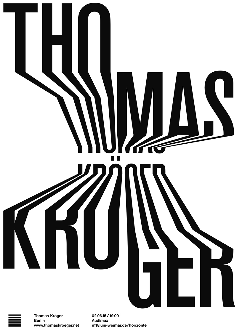
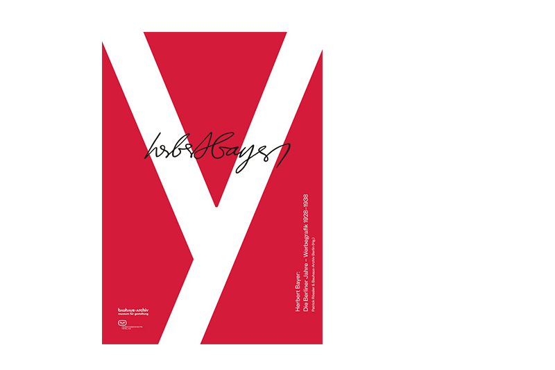
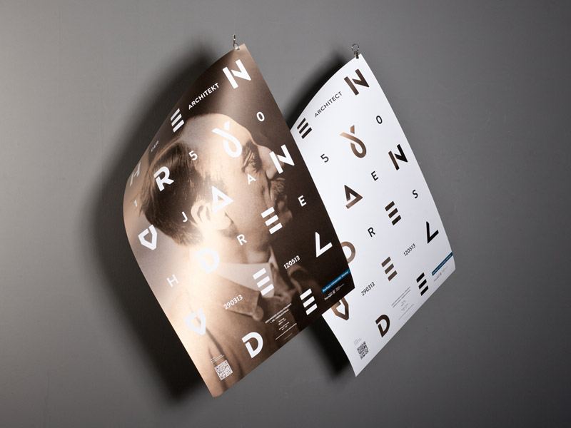
Robin Weißenborn, Studierender der Visuellen Kommunikation an der Bauhaus-Universität Weimar, gehört mit seinen Arbeiten zu den besten Plakat-Designern aus Deutschland, Österreich und der Schweiz. Er wurde im Wettbewerb der »100 besten Plakate 2015« ausgezeichnet. Alle Sieger-Arbeiten werden ab dem 16. Juni 2016 im Kulturforum Potsdamer Platz in Berlin zu sehen sein.

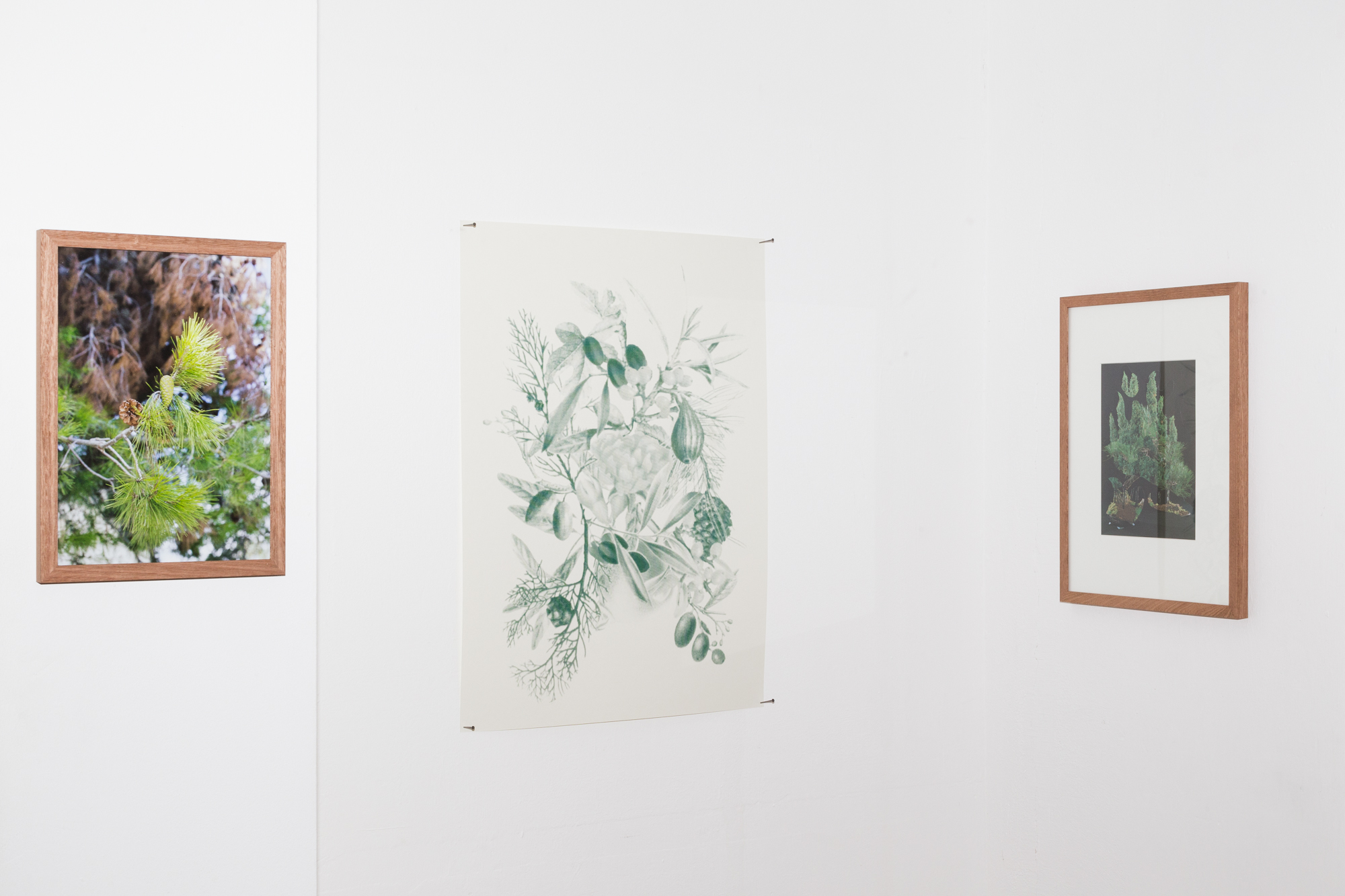
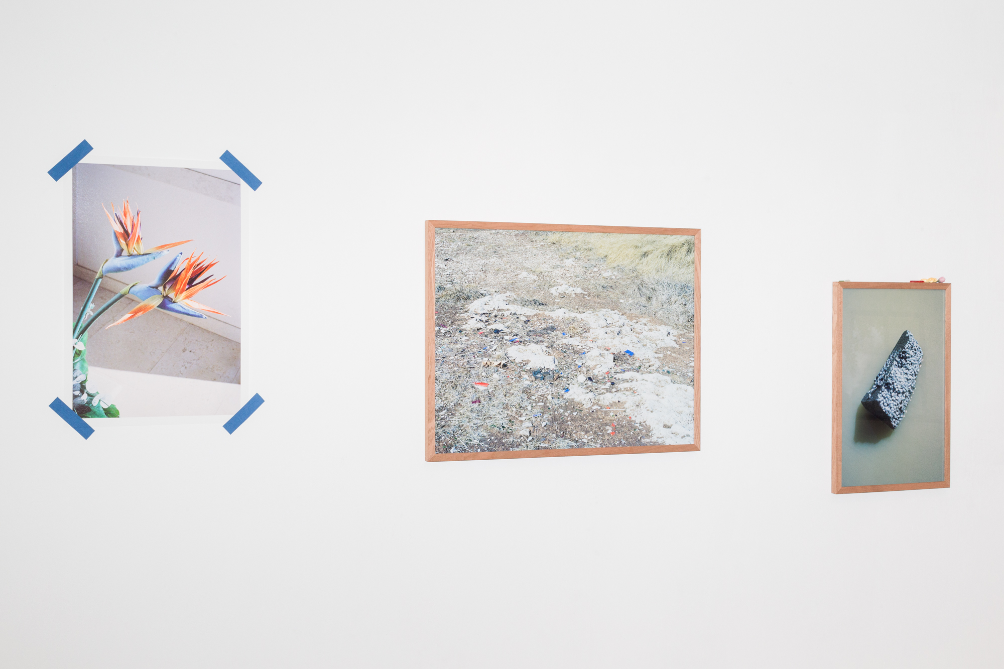
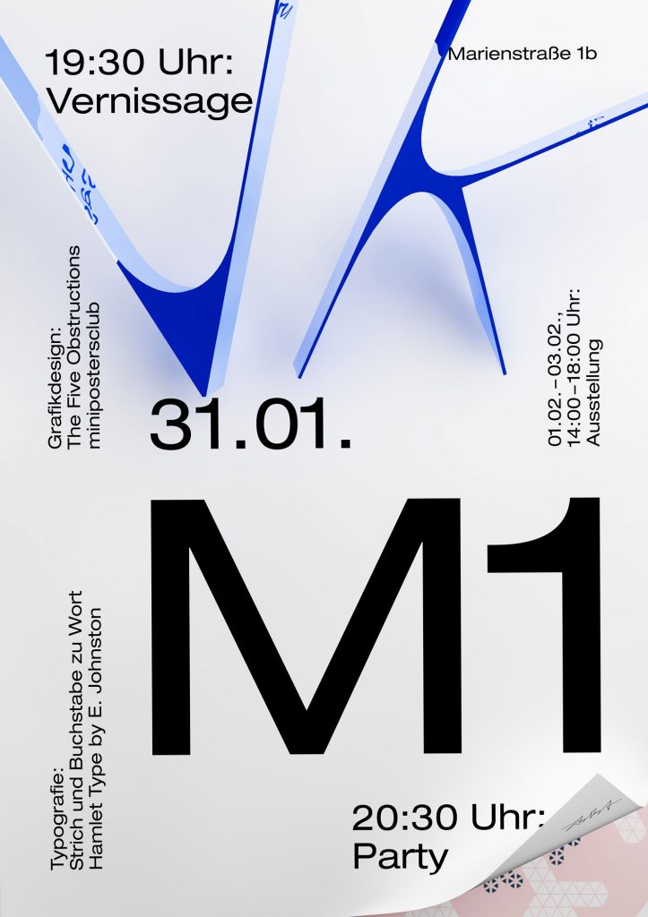
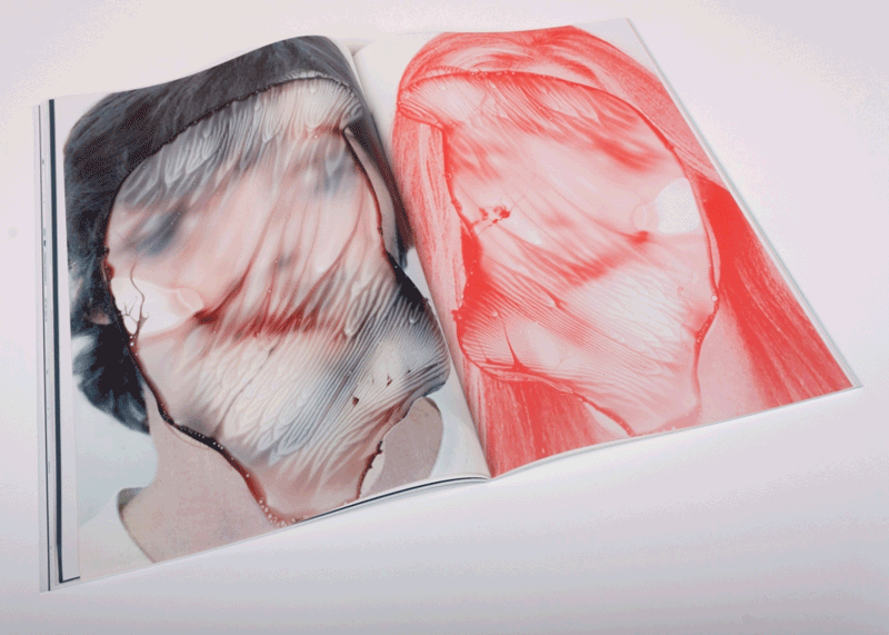
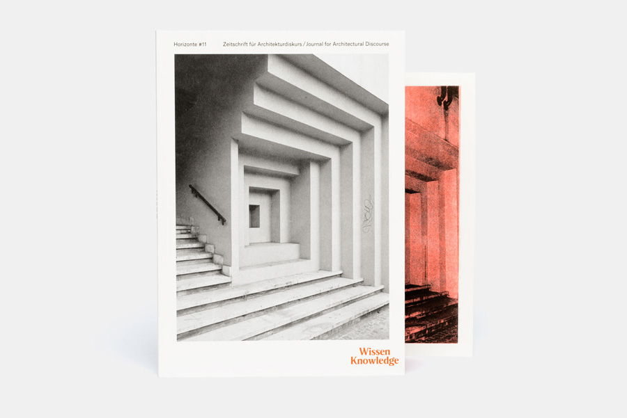
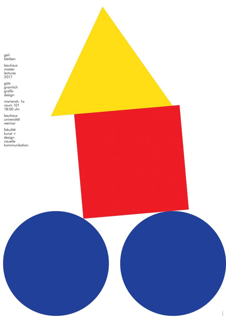
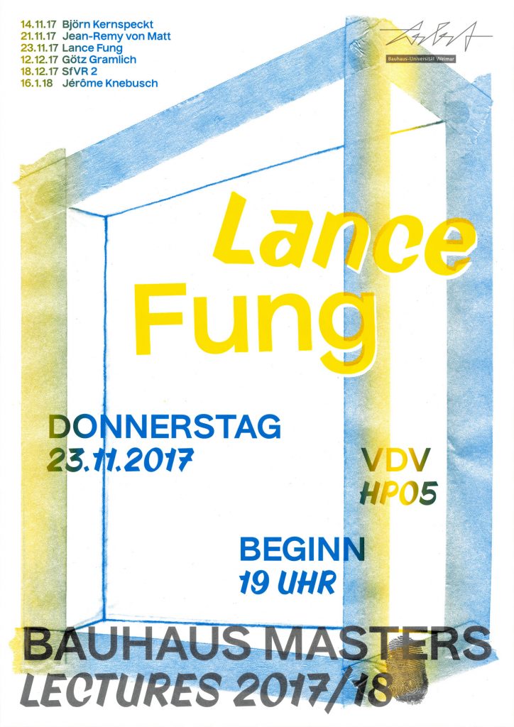
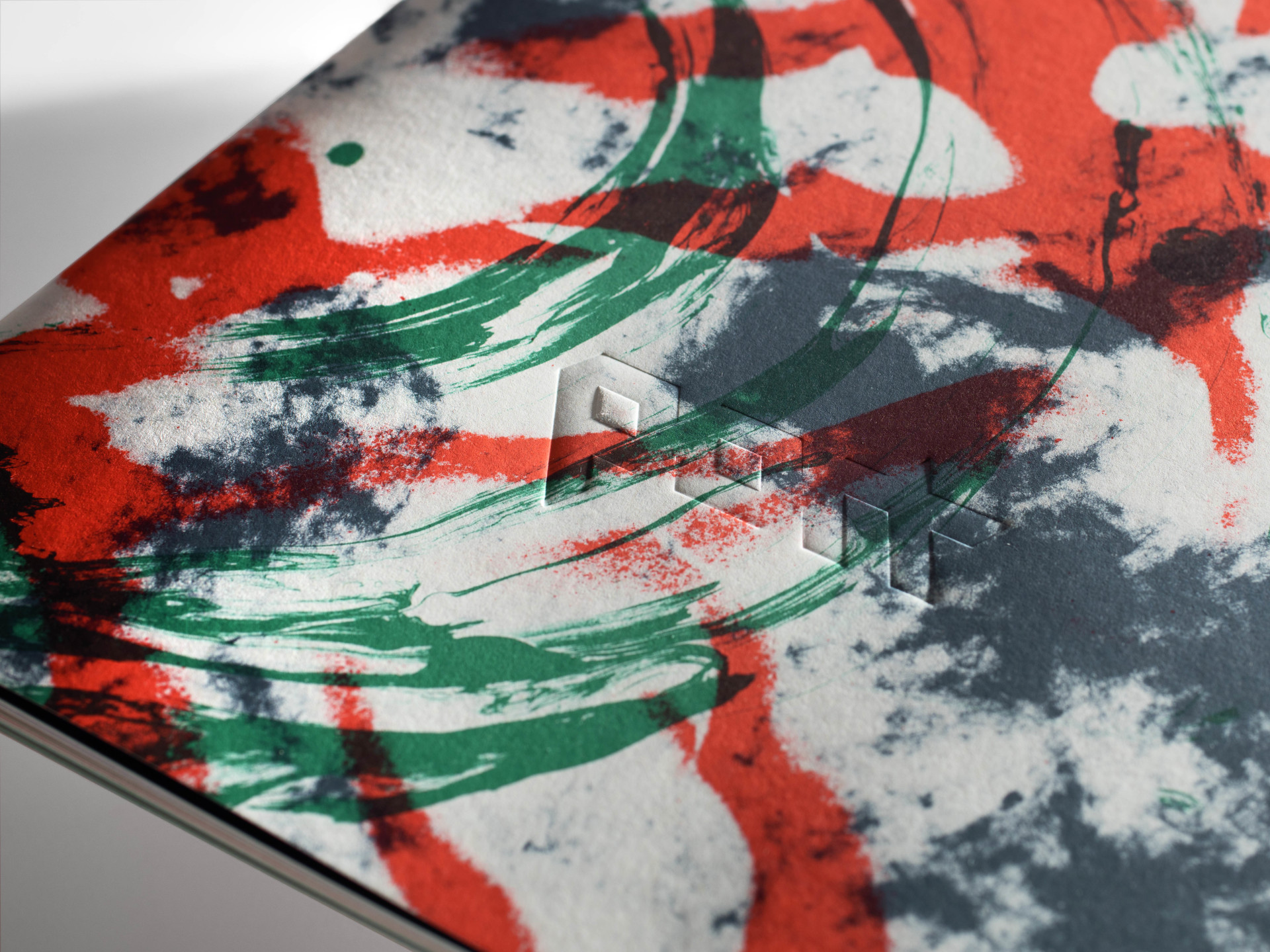
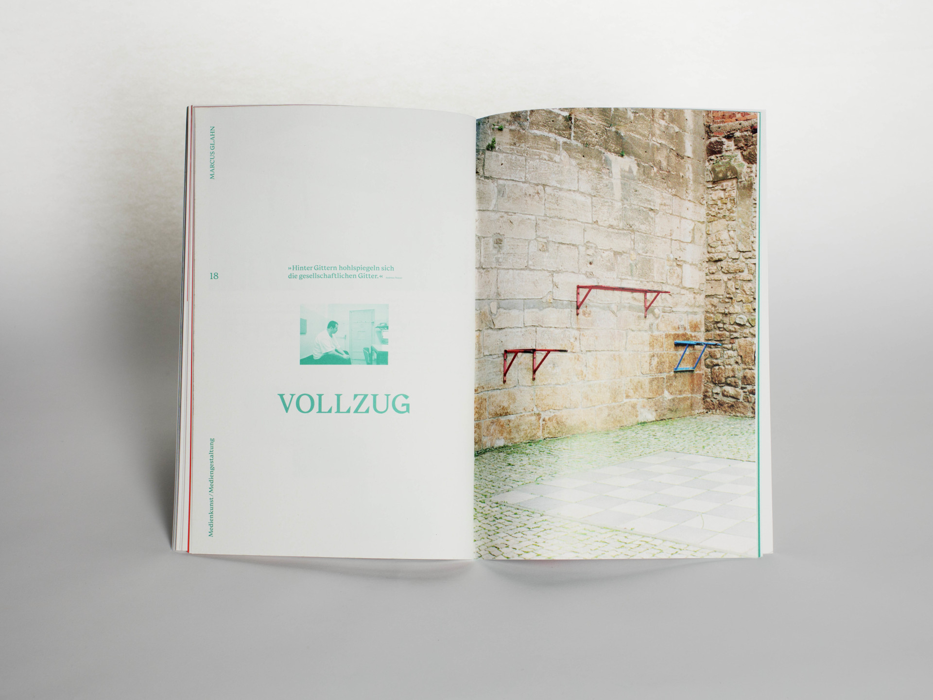
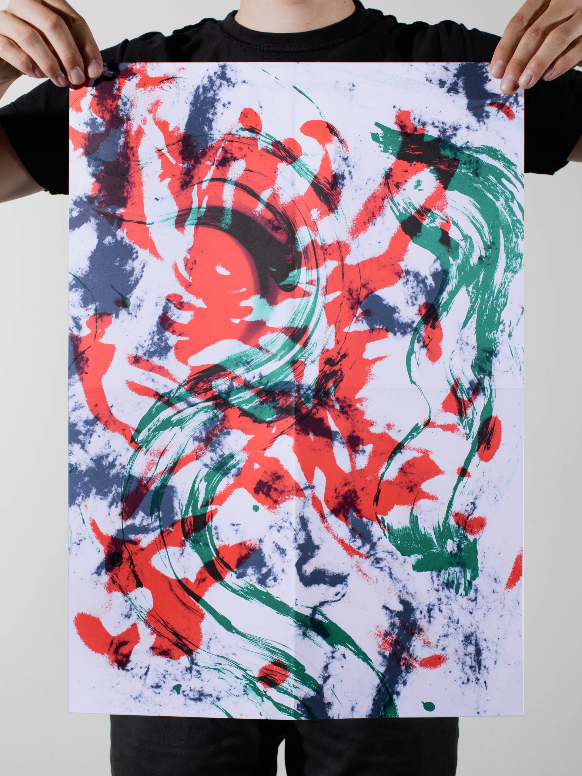
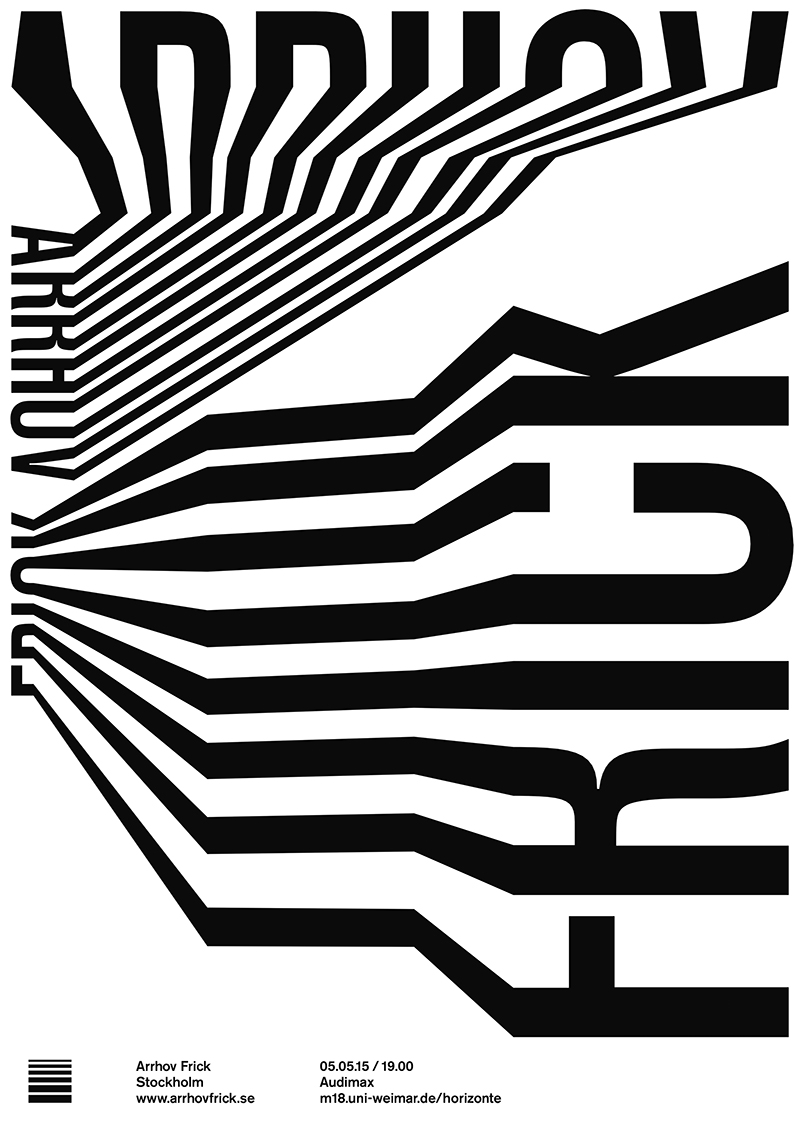
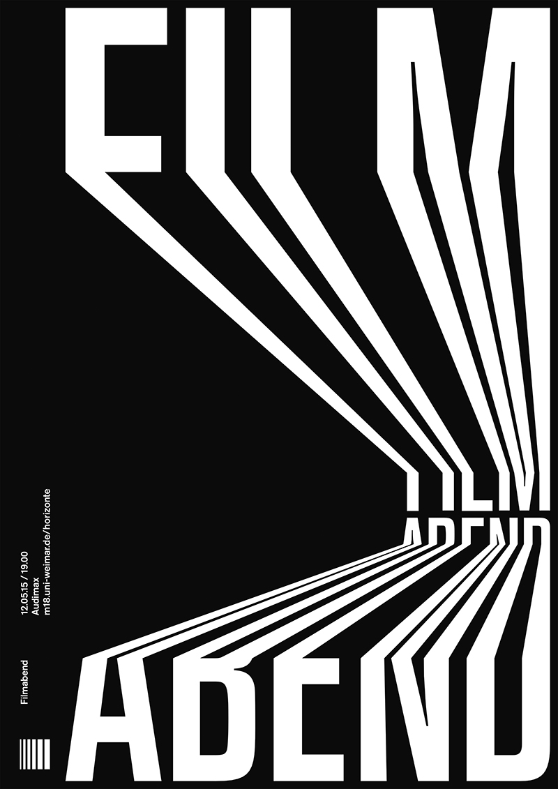
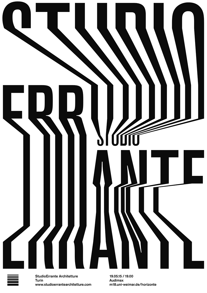
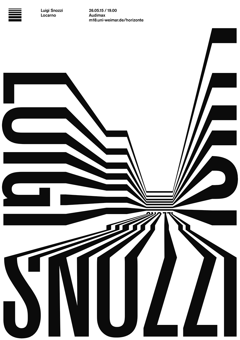
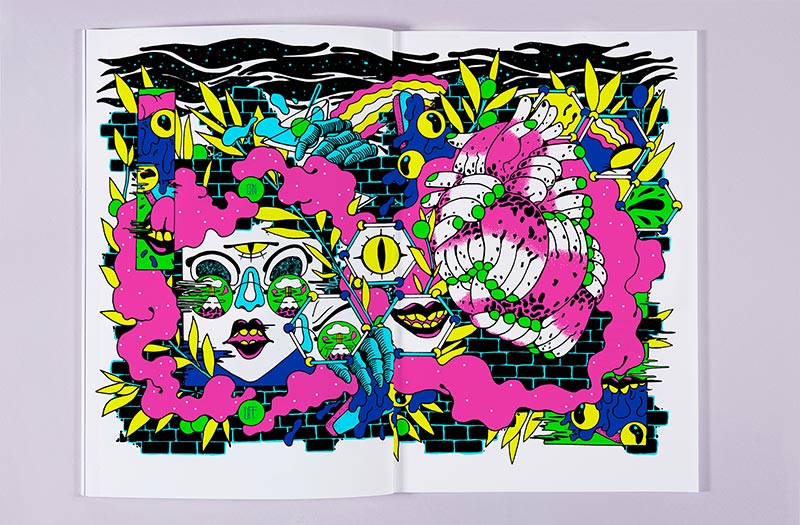
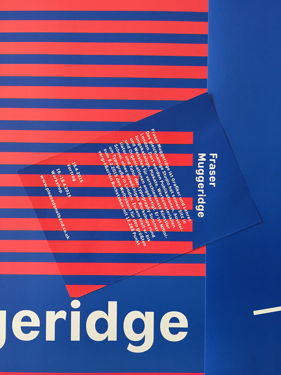
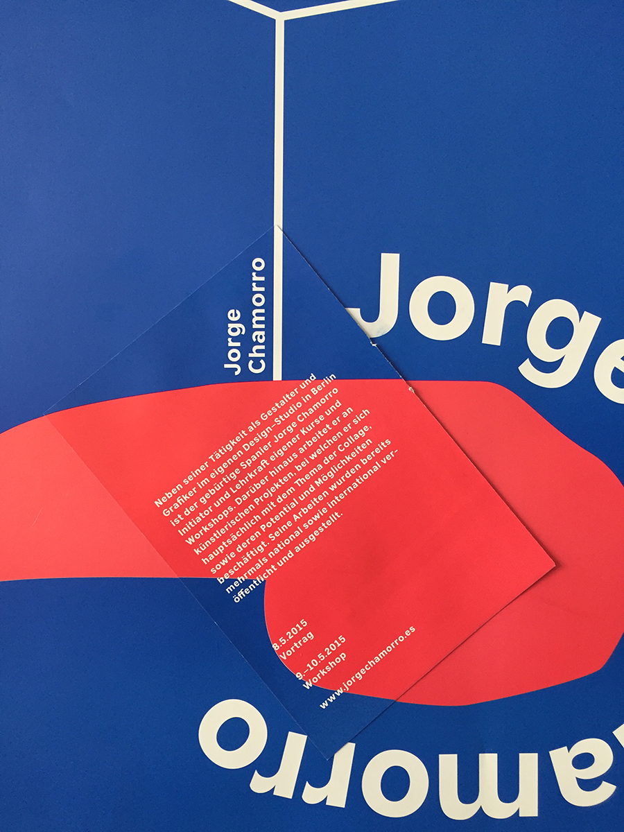
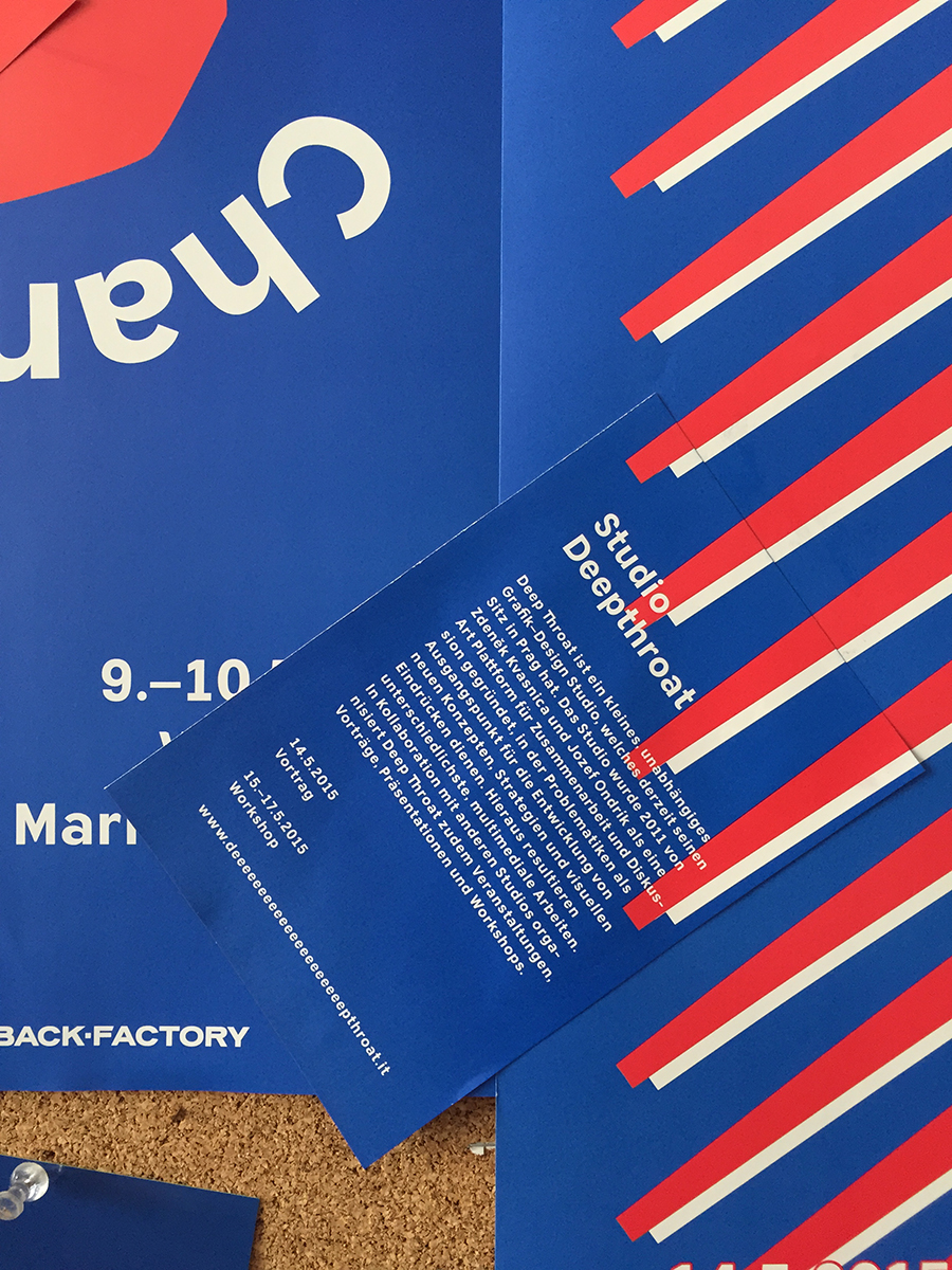
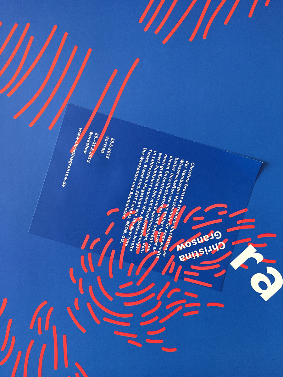
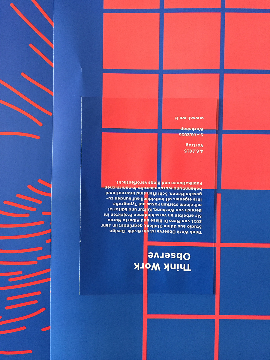
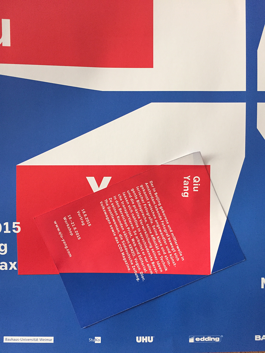
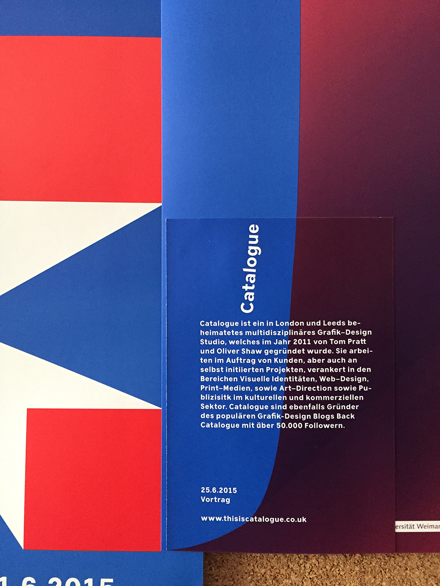
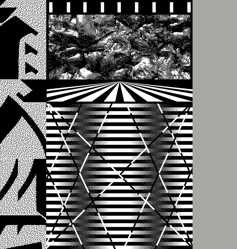
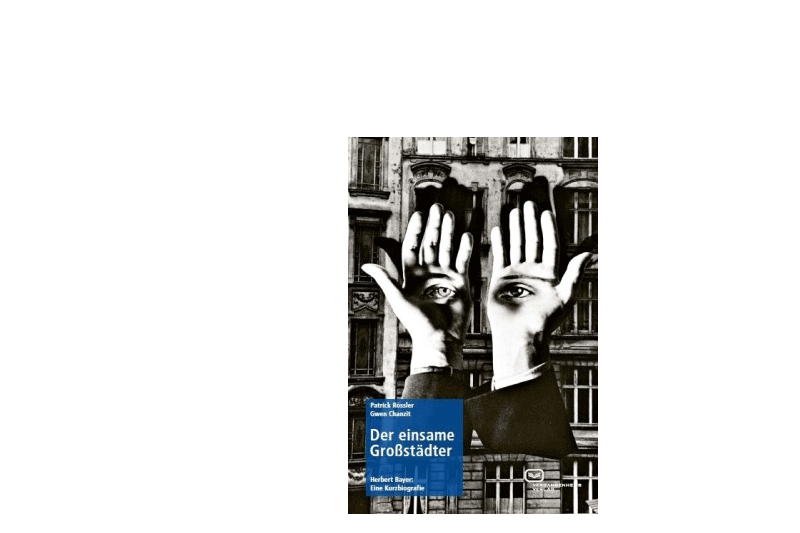
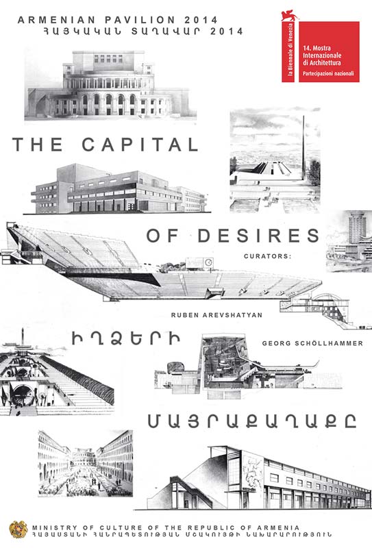
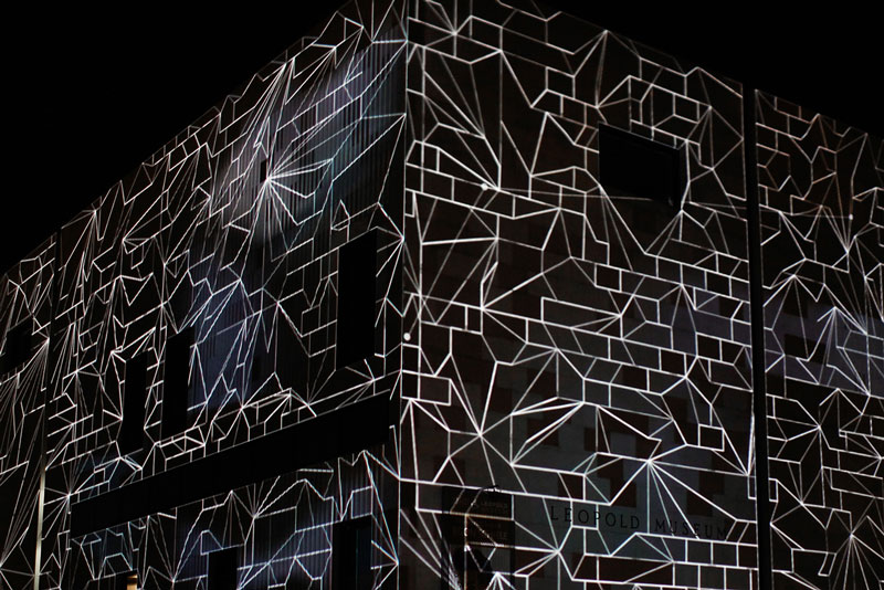
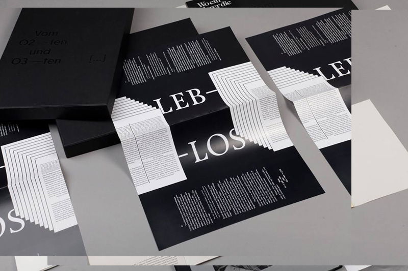
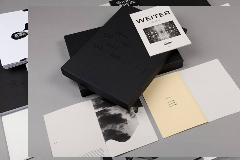
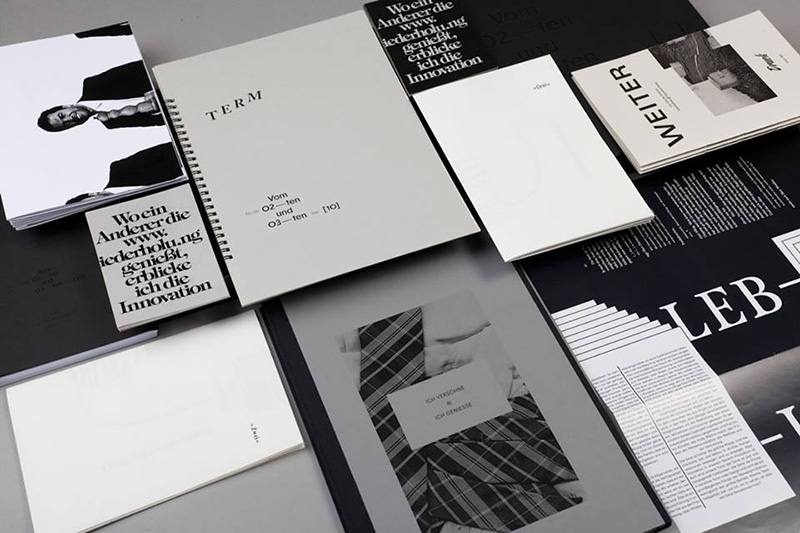
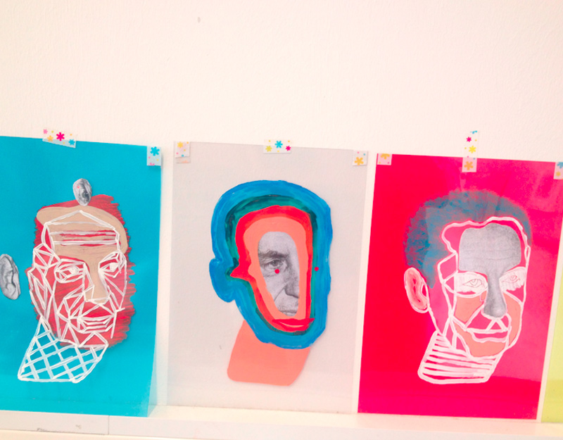
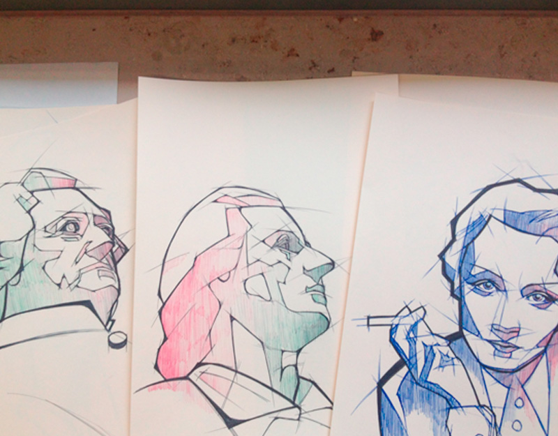
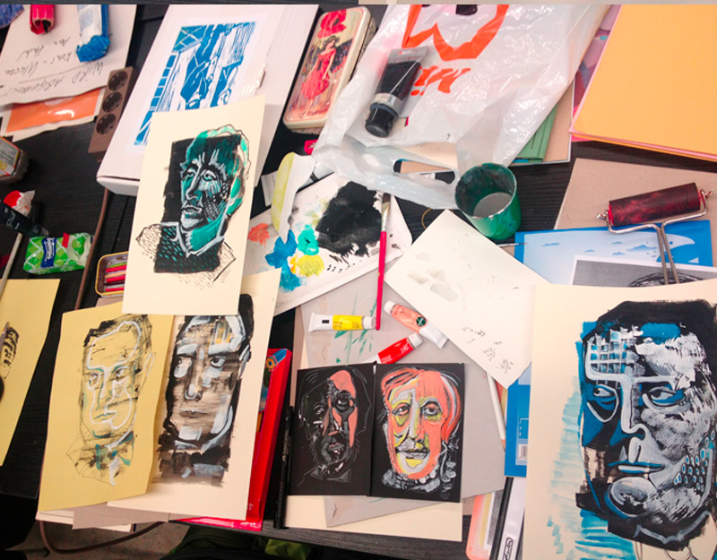
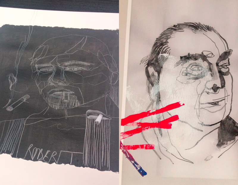
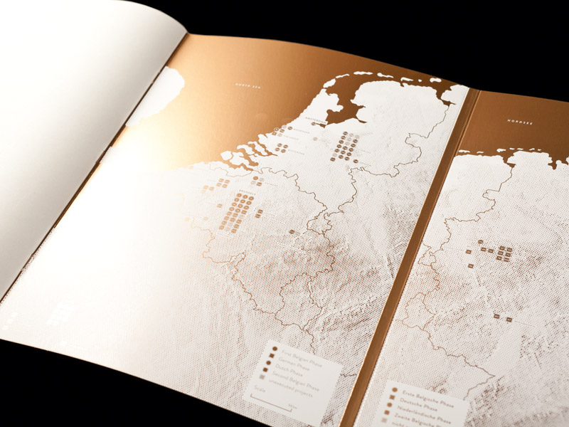
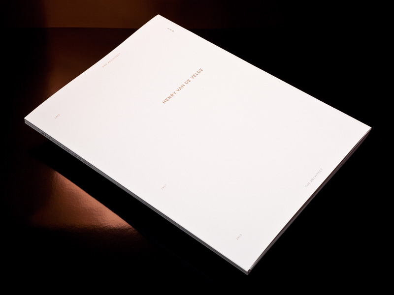
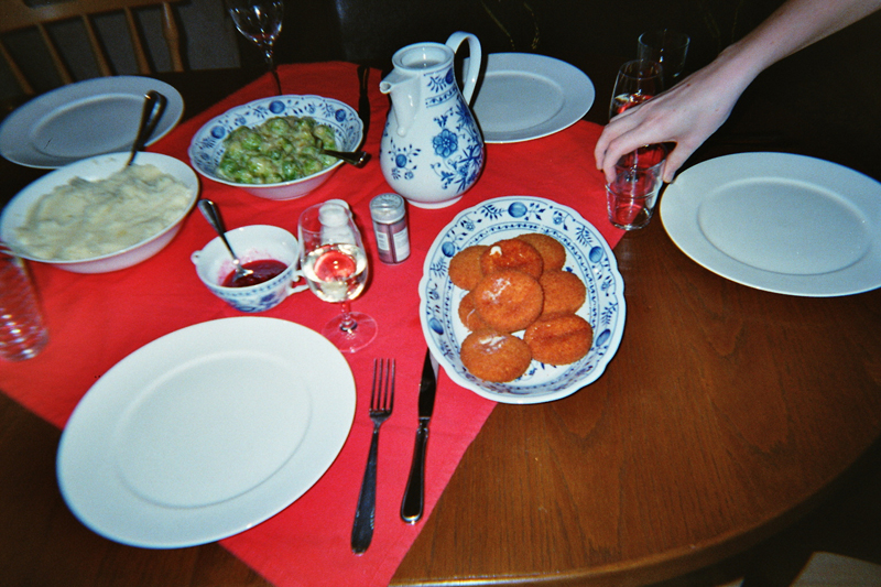
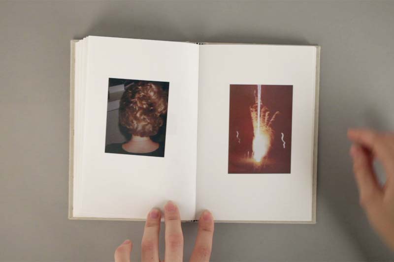
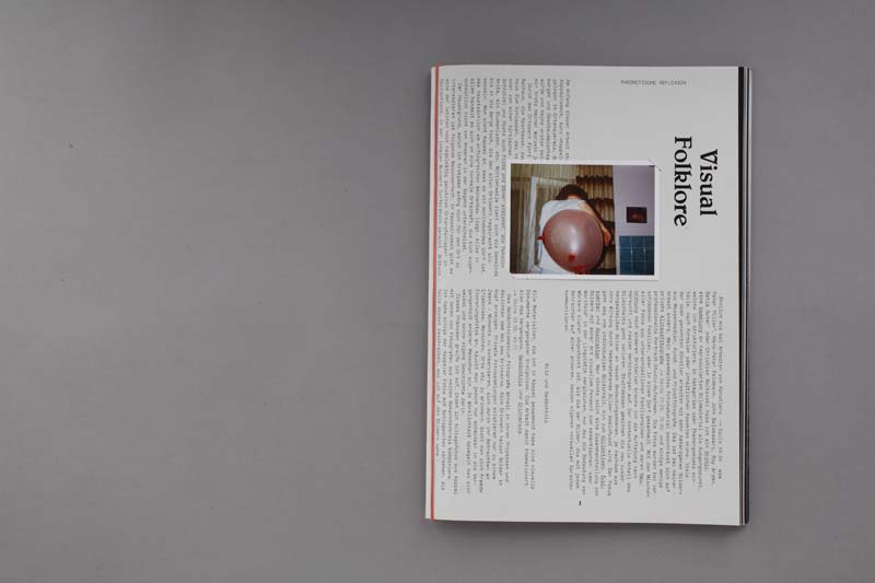
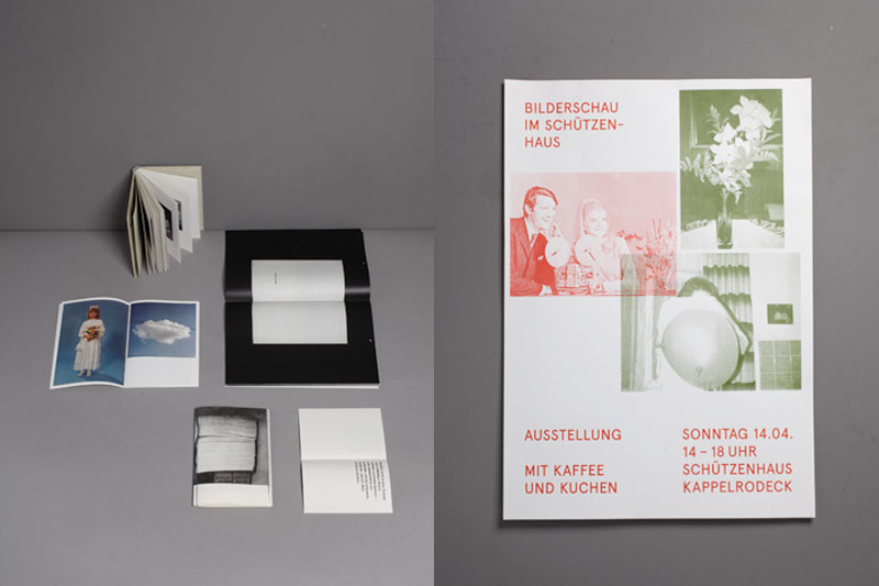
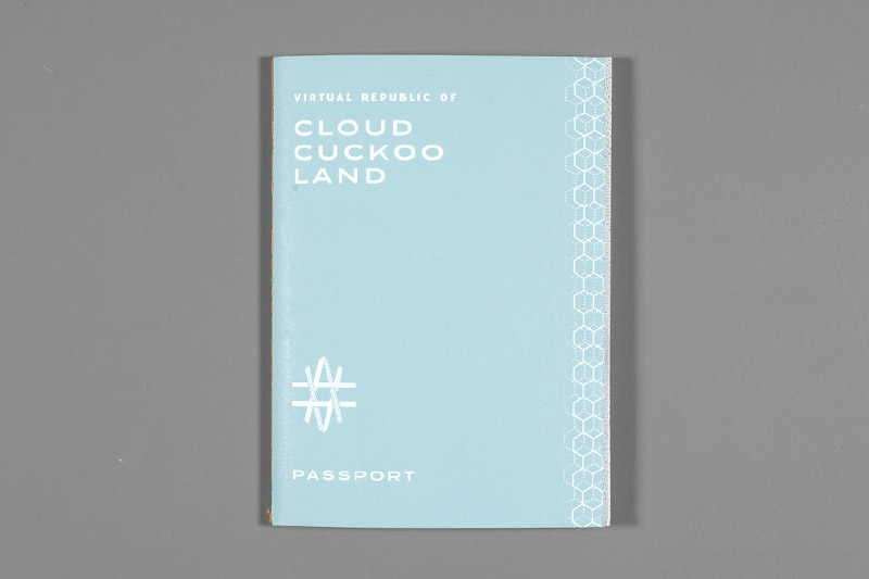
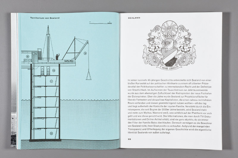
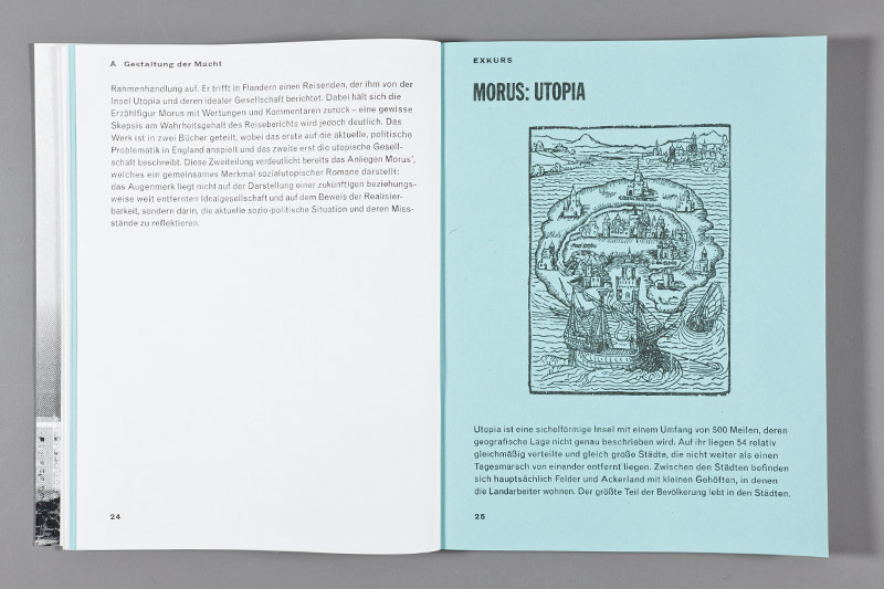
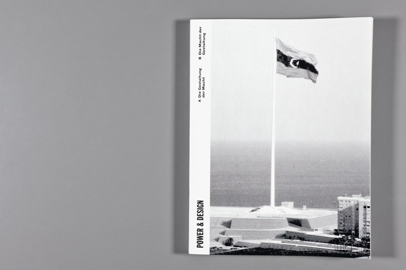
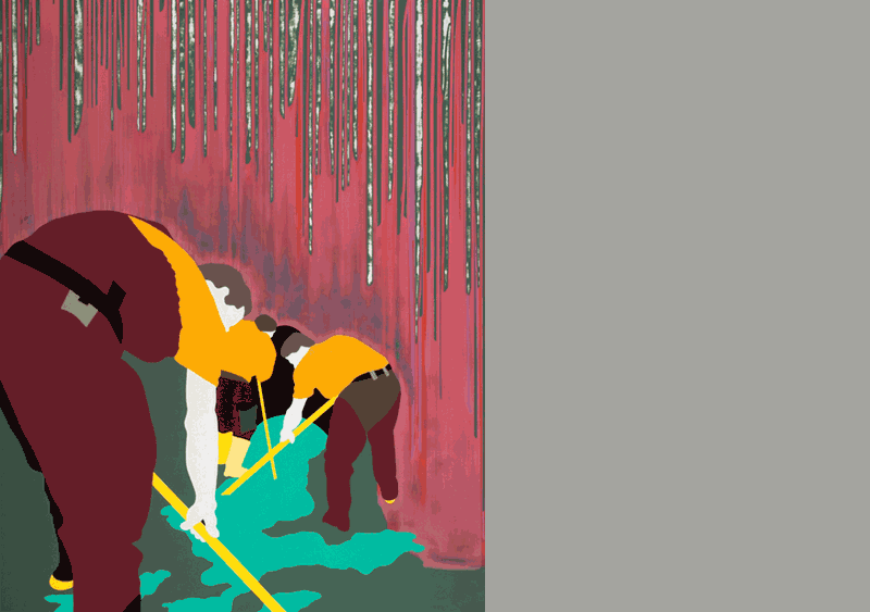
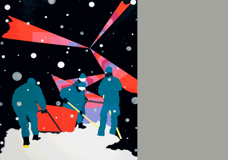
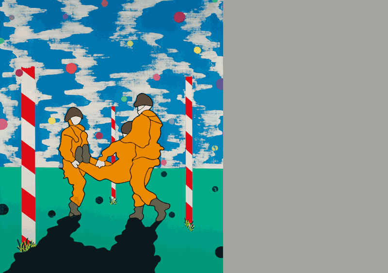
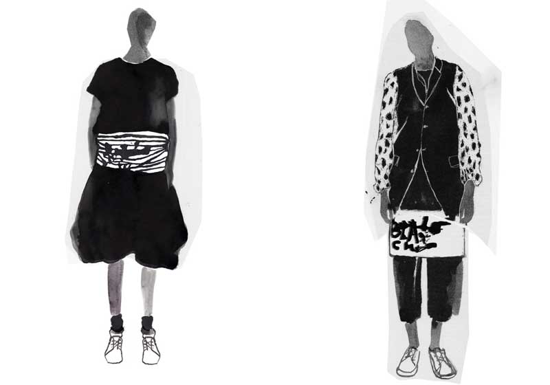
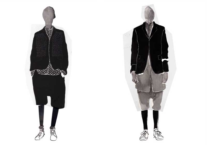
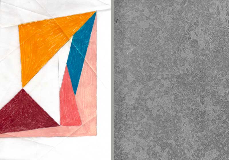
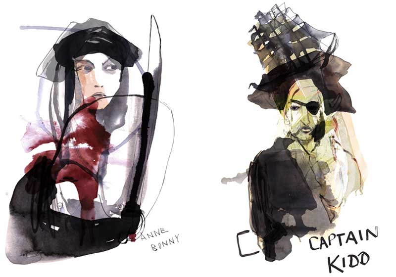
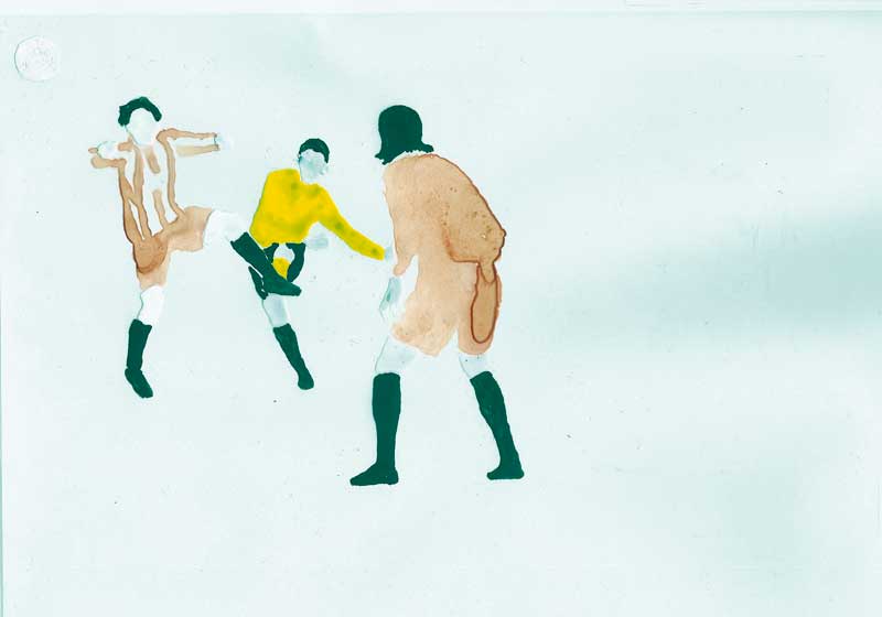
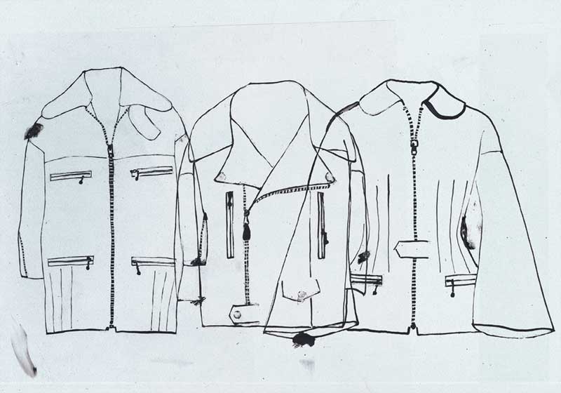
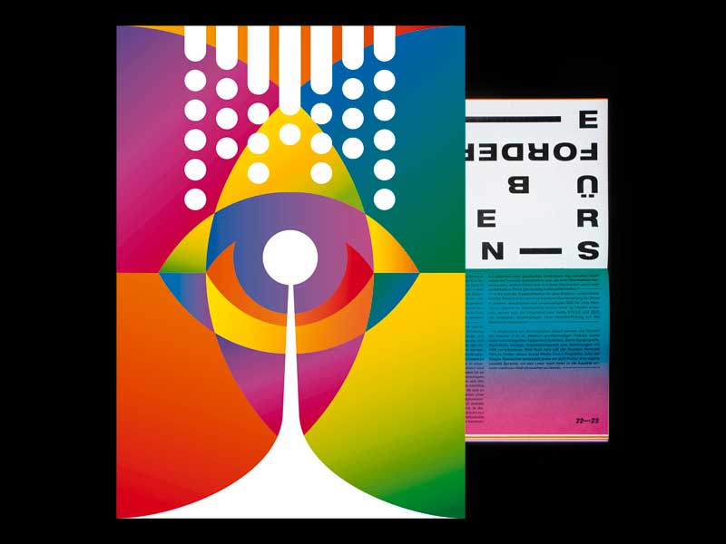
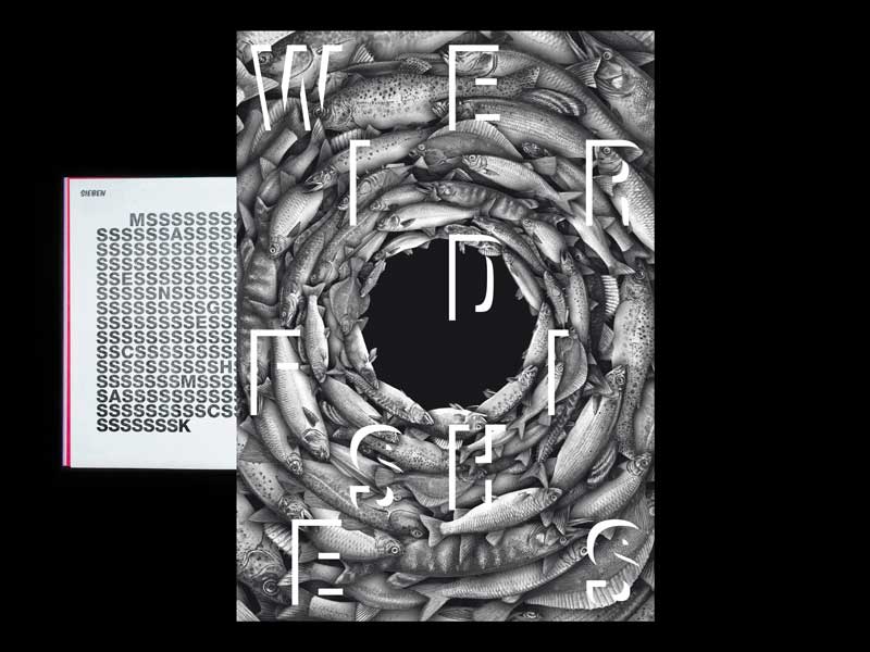
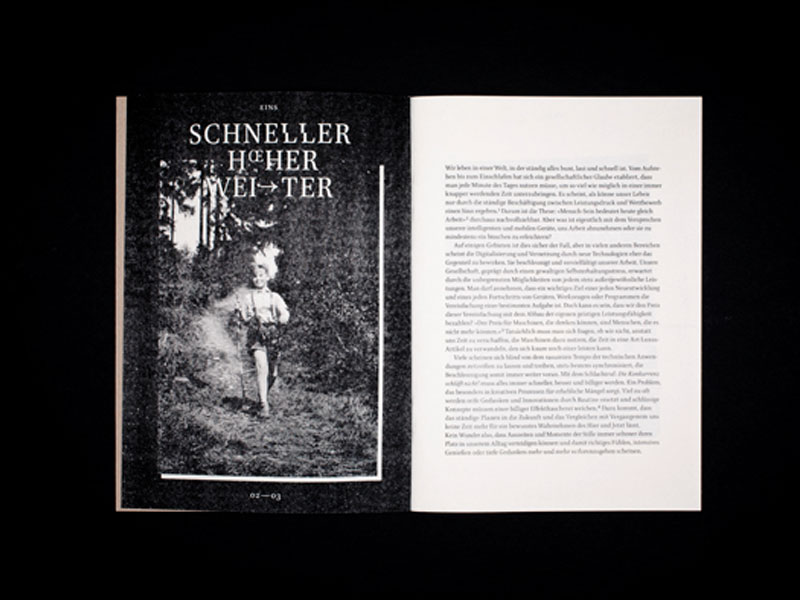
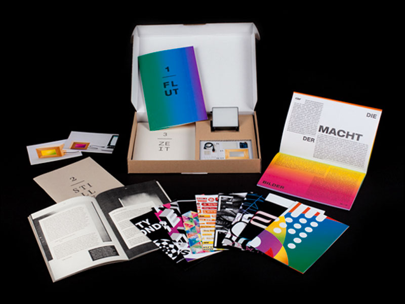
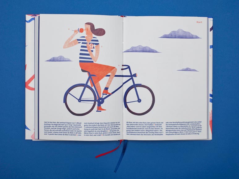
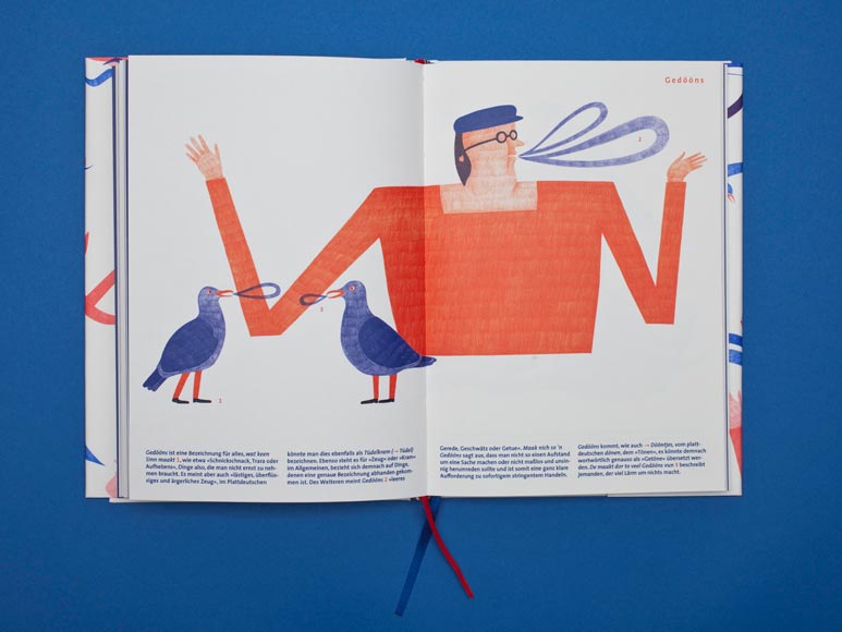
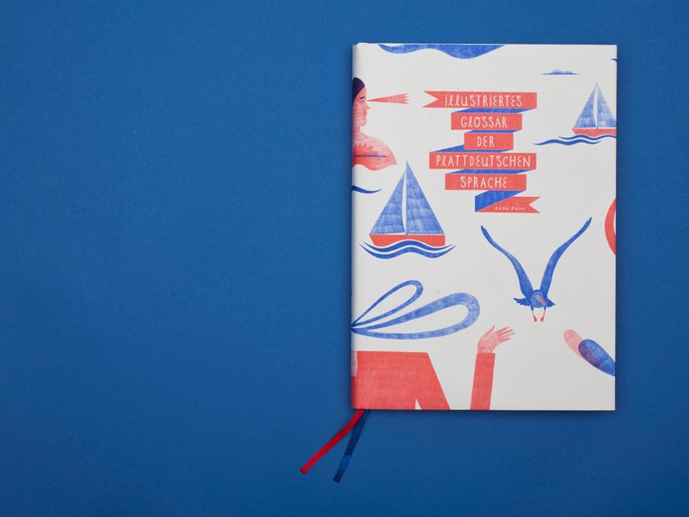
Die fünf Plakate, die Robin Weißenborn beim Wettbewerb eingereicht hatte, entstanden für die Ankündigung von Vorträgen der studentischen Initiative »horizonte«. Diese richtet ihren Blick auf unterschiedliche Theorien, Objekte und Berichte aus Architektur, Kunst und Design – sowohl in Vorträgen als auch im eigenen Architekturjournal.
»Ich freue mich, dass sich durch den Gewinn auch ein Mehrwert für die Initiative ›horizonte‹ ergibt«, so Weißenborn. »Als Gestalter ist es wichtig, seine Arbeiten zu präsentieren um weiter zu kommen. Meine Plakate sind jetzt offiziell ausgezeichnet.« Folgeaufträge habe der Studierende ebenfalls schon aufgrund der Prämierung bekommen.

Alle Gewinnerarbeiten werden ab 16. Juni 2016 im Kulturforum Potsdamer Platz in Berlin gezeigt, bevor sie schließlich auch international in einer Wanderausstellung zu sehen sein werden. Zusätzlich erscheinen sie im Jahrbuch der »100 besten Plakate«.

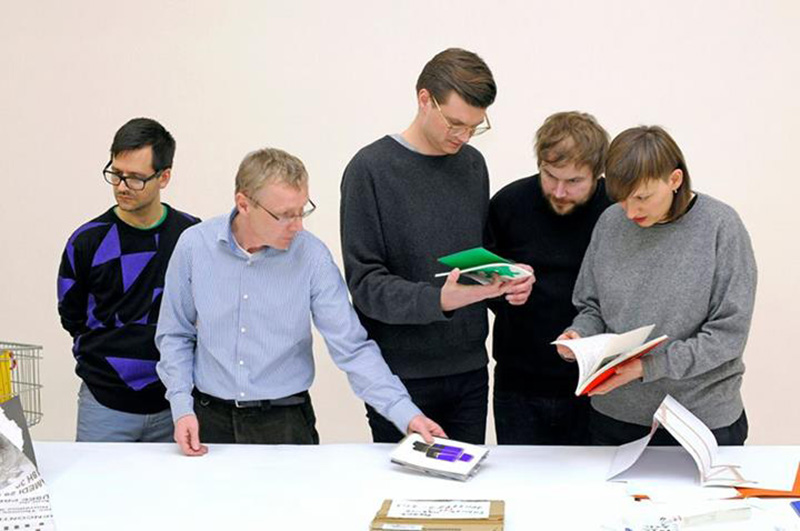
Eine fünfköpfige, hochkarätige Jury tagte Ende Februar in Berlin, um aus den 964 eingereichten Plakaten die besten auszuwählen. Am Wettbewerb nahmen insgesamt 605 Künstlerinnen und Künstler sowie Grafikerinnen und Grafiker teil. Neben Agenturen, Studios und Auftraggebern waren auch 185 Studierende unter den Bewerbern. »Es ist augenfällig, dass gerade an den Hochschulen […] die Plakatgestaltung stark gefördert wird. Die vielen studentischen Arbeiten unter den ausgezeichneten Plakaten sind dafür ein ermutigendes Beispiel«, so der 100 Beste Plakate e. V. auf seiner Website.

Mehr Informationen und alle Siegerplakate finden Sie unter: 100-beste-plakate.de
Die für die Einreichung und die Ausstellung notwendigen Offsetdrucke fertigte freundlicherweise die Druckerei »Saxoprint« (Dresden) an.

THNK TNK MAGAZINE

„THNK TNK magazine sketches out design strategies that involve into societies development. Actively. We interviewed artists, designers, NGOs and entrepreneurs, asking how they do what they do, what they aim for by doing so and what we as students can learn from their stories. Second issue „social entrepreneurship“ features international artists and organizations such as Can Pekdemir from Istanbul or beeple as well as talents from Bauhaus University working in the fields of visual communication, product-design and media culture science.

Just as issue 1 „political communication“ is for download on thnktnkmag.com and availble in print at Lucia Verlag

Upcmeing issue 3 is centered around urban planing and the idea of techno-optimizm“

Peace

Forms of Formalism N.2

FORMS OF FORMALISM is a platform collecting photographic works and written contributions on the topic of »Forms«. The second edition contains series from Bert Danckaert, Daniel Everett und Julian Faulhaber as well as essays from Tiziana Agus, Matina Kouisdi und Laura Zorzi.

»What is formalism? The countless facets of such a notion keep us inquiring into its nature and possible manifestations. One may assume it is about conception or examination through aesthetic composition, whereas shape and structure — overall technical features — prioritise the medium over content and context. However, since the outset, we’ve been arguing and reflecting on what could represent a meaningful compendium of images and texts under the name of formalism. […] In the grey area between form and meaning, we further this inquiry with the hope of collecting and supplying significant points of view.«
(Introduction from Louis De Belle)

116 pages
10 x 15 cm
June 2015
ISBN 978-3-945301-24-1
Offset

http://forms-of-formalism.com/

http://luciaverlag.de/shop/einzelpublikationen/forms-of-formalism-n-2/

MEL NGUYEN

In the work of Mel Nguyen the borders between graphic design and art dissolve. The former international Bauhaus-University Weimar student interweaves traditional handcrafts with modern media in her creations. To see more of her work get the latest issue of Missy Magazine or visit her WEBSITE.

THE ARTOGRAPH

The artograph’s workshop is a space for materials and practices of visual order as well as an intervention in the constructed work practice to negotiate aesthetic work and identity.

The shop’s concept was developed as a master project by the former Bauhaus students Christiane Schlütter and Tina Engelmann. In December 2013, it has been established as a company set in Karlstraße 6 in Weimar. Besides selling a fine selection of personalized products and paper goods, various services and weekly workshops are offered.

For further information and upcoming workshops visit the artography’s WEBSITE.

New Publications about Herbert Bayer

Herbert was a pioneer of modernism and also student of the early Bauhaus. His work is still an inspiration for the students in Weimar as well as for many graphic designers of the present and the future. In the current project of our graphic design class called Fläche, Linie, Wort und Rhythmus students often research Herbert’s work and his achievements. You can find more detailed information about him in these two books:

Herbert Bayer: Die Berliner Jahre – Werbegrafik 1928-1938
Author: Prof. Dr. Patrick Rössler
Published: 2013 by the Bauhaus-Archiv, Berlin
ISBN: 978-3864081590

Der einsame Großstädter: Herbert Bayer und die Geburt des modernen Grafik-Designs
Author: Prof. Dr. Patrick Rössler
Published: 2014 by the Vergangenheitsverlag, Berlin
ISBN: 978-3864081538

You also can find both books in the digital catalogue OPAC of our Universitätsbibliothek.

COLOUR CLASS

Students of the Bauhaus-Universität Weimar, feat. Steffen Gross, shown photographic-based works at Gallery Rothamel Erfurt

»People experience a great delight in colour, generally. The eye requires it as much as it requires light.« J. W. v. Goethe ( The Theory of Colours)

Based on a photography-course given by Steffen Gross in last semester arising an exhibition at Gallery Rothamel in Erfurt. Starting from practical reflexions about colour in photography various works in different ways and technics are developed.
COLOUR CLASS shows photography, objects and installations from march 22 to april 5. You are welcome to the opening, starting saturday night at 9.00 p.m.
From Lucia-Verlag (www.luciaverlag.de) you can receive the catalouge (ISBN 978-3-945301-00-5)

Happy little accidents

A Weimar based studio for graphic design, typography and identity, recently founded by Tobias Dahl and Patrick Martin a few month ago. After years of collaboration, the work of Tobias Dahl and Patrick Martin have been honored with several national and international design awards: including Red Dot Award, European Design Award, awards from the Art Director Club Germany and Type Directors Club of New York.

Visit their brand new Website

Jan Robert Dünnweller

Commissioned Illustrations for three different articles of the august issue of brandeins, concerning three topics:

– Web-privacy and tools for self protection

– Sweden wants to dispose cash for electronic money transfer
– „lets be silent“ – about how train travellers type their secrets into electronic devices instead of talking to each other.

Art Direction by Meiré und Meiré.

More Work on his Webseite

Janna Seiter – VISUAL FOLKLORE

As a person from the outside, I collected the visual material of one single village and reedited the pictures, texts and film clips in order to create new associations, relations and interpretations. The research was certainly „field work“: interacting with the people of the village, collecting their personal stories and photographs accessing private and municipal archives were a big part of the project and its material.

Visual Folklore deals with the found footage from a formal point of view, analizing its context, themes, language and photographic practise. The decontextualization of the material makes the private images and films more accessible to another audience and creates new connections. With a new order and combination, the images inherit a different level of interpretation, playfully revealing the daily life`s beauty and weirdness.

Patrick Martin — Power & Design

Based on the absurd aesthetics of micronations Patrick explores in his diploma project the visual representation of power as well as the historical and political meaning of national symbols. In a second step he also founded his own virtual micronation «Cloud Cuckoo Land» setting up an embassy in Weimar, in which everyone can apply for citizenship and receive a passport as confirmation. more

Berit von Enoch – The Fixation of Light

Berit’s diploma can be seen as an aesthetic investigation of the dialogue between light and photography. Thus, the focal point is the foundation for every photographic picture: the light.
It is a search for the appearances of light, looking for new and partly-generative forms of expression of photography, whose increasing ordinariness and banality in our digital era irritates the artist. During the occupation with the character of light and its meaning for photography she dealt with two other complexes: the phenomenon of colour and the interaction of light and water. In this process, altogether nine photographic products emerged verging on the topic in different ways while illustrating the range of visual expressions photography is able to create.

Stefan Schiek – Paintings


Stefan Schieks paintings are one thing in the first place: disturbing and deceiving. They are eery and strange, something is wrong here. These paintings are not what they appear to be. The bright and introspective colours want to take away the recipients fear. They snatch them into an illusory world, contradicting the shown situation, the context of the image gets dizzy and another meaning at the same time. Nature and culture are played off against each other, contents get a new meaning, it is confusing. These paintings deal with a familiar world in a state of dissolution. Things that were certain yesterday don´t mean anything the next morning. They tell us about a time of decay, people reveal their doubts, disband their nightmares, collective subconciousness is swashing to the surface. Facing the near breakdown, only the total disclosure of weaknesses is able to bear something new.

Gentle by serien.lighting


„Gentle“ is a lampshade from Katharina Merl and Christina Lobermeyer who used an old handcraft technique to create it, called „smocking“. 
It was developed during a textile project by Heiko Bartels and Welf Oertel in 2010. 
Within this time they contacted the two heads from serien.lighting in Frankfurt who where amazed by this lampshade idea. In the end they developed a series of different lamps out of this idea called Gentle which will be launched in autumn.

Visiting Illustrator Laura Ann Huber


Laura creates intuitively and is mainly inspired by everyday life and abstract art, which are inseparably connected, according to her. She has a sensitive way of showing the imperfections of things and people in her images/illustrations. They seem to include a hint of coincidence, but actually show the miscellaneousness of life itself and its peculiarities. Her themes are courageous and curious, as are her experiments on structures, colours and shapes. We are happy to have her as visiting Teacher for Illustration and Fashion this Semester. More work on her Illustration Portfolio and her Website

Jörg Brinkmann – Simulation

https://youtube.com/watch?v=NkMp4QMVzmo%3Fversion%3D3%26hl%3Dde_DE
A speech about Love itself extracted from a YouTube video is projected back onto the human body through a self build device. The device that is presented in the video work can be seen as a low-fi talking simulator: It consists of a servomotor controlled by a computersystem. The servomotor is attached to the lower lip of the subject and reacts to a speechfile, fed into the computersystem.

More work on his Website

Natalie Mohadjer – Weimar Paradies


The onset of twilight heralds the kids’ time: In the evening the high-rise community of Weimar-West belongs to them. Weimar-West, the city quarter built in the 80’s and isolated from the rest of the idyllic cultural city of Weimar, faces challenges like a high level of unemployment, an aging population, conflicts between foreigners and neo-Nazis and reflects a poor image. Since 2001, the quarter has been peripherally integrated into the program “Social City”.


See the rest of the series and other great works on her Website