Concept
- Which problem did you identify?
Based on our research on the use of bookmarks, we decided to revise the concept of how users organize and structure them. In interviews with other students who are quite experienced in browsing and friends and family members who only casually move through the internet, we came to the conclusion that most users only utilize the very basic functions provided by the bookmark system as it is today. Only a few people manage their bookmarks in folders. Websites that are not visited regularly (e.g. certain blog entries, interesting videos, pages with static content) often don't even deserve a bookmark and some users even prefer to search the internet again for a specific link, than to search their bookmarks.
- Why are current systems unable to solve this problem?
The current bookmark system is unable to handle this problem because it is to elaborate for most users. Even if it is easy to structure something with the folder hierarchy, it just takes too much effort for most people. Not to forget how easily and quickly a bookmark can slip through the cracks, never to be seen again in a 10+ folder structure. Creation of a new folder and the editing of a bookmark itself take time, which is too much to handle for most people. They want the creation process and general managing of the bookmark system to be fast and simple, without much editing or maintenance on their side.
- What research findings led you to your first concept?
Through our research we found out that most users use their bookmarks only for sites they visit regularly and then the bookmarks would most likely be placed in the toolbar, where their position and icon helps to rapidly recognize and open the desired page. That shows us that the positioning and appearance- even as an icon- of a bookmark means more to users than a name or some Meta information they have to laboriously edit and supply.
- In 140 characters, what is the essence of your project/solution?
Our goal is to make organizing and browsing bookmarks more easy and effective by introducing a visual, desktop-like display. Users are able to arrange their bookmarks as they see fit using their position, grouping, appearance and can freely move them per drag & drop. The bookmarks themselves are easy to distinguish by a snapshot, which consists of the site's icon and a small preview.

Implementation
- How did you ensure that a beginner can use your solution?
We want to use a visual, desktop-like display that users are already familiar with. Everyone that works with a computer knows how to organize and move folders and other things on their desktop around. The creation of a bookmark doesn’t really change that much, the user merely saves the bookmark to the Bookmark Wall and can, if he wants to, choose a folder to save it in. To position it on the Wall he can simply drag it around or drop it into a folder.
- What makes your solution more useful or efficient than current products?
Our solution is more efficient and useful for users because our concept works mainly with visual representations of bookmarks which users are able to identify and recognize effortlessly and swiftly. They can find bookmarks more efficiently through their position and appearance than just through a name, edited or not. We try to motivate and encourage even the users, who don't fanatically organize and maintain their stuff because it is to slow and arduous a task, to use the bookmark system. It is easier for them to organize their bookmarks using their own system and structure while with a more visual and graphical representation of the whole bookmark system.
User Research
Results
- there is a clear separation of frequently used pages and the “treasure trove”: the habits of the user decide if they are stored in files with a command structure or not
- frequently used pages are seldom expanded and liable to a static hierarchy, therefore they have a fixed position and an easily recognizable icon
- the bookmarks in the treasure trove are sometimes renamed to fit the user, but mostly not bothered with
- users which are very familiar with the existing bookmarks system are unsure of and even fear the changes the system could undergo, because their usual system of recognition and memorization of bookmarks could become unsuitable
- bookmarks are mostly only edited if they’re used frequently, otherwise it’s not worth the bother
- easy synchronization between different devices should be possible as some users tend to use their bookmarks on more than one device: the new visual implementation should be able to be viewed with different resolutions
- the user wants to categorize and file their bookmarks fast and without much effort
- it’s important that they don’t have to dedicate much time to create a bookmark and everything stays cleanly arranged
- if there are no Bookmarks, instead of entering known URLs into the address-bar, they are typed into the search-engine-bar and let google make a clickable link out of it
- characteristic recognitions of webpages (related to the possibility of using screenshots) are coloring, position of the navigation, logo and funtionality
- bookmarks don't replace the search-engine, i.e. known and arranged sites are still googled first
Goals
- making the bookmark system more attractive by means of a visual wall-like display => Tab Candy, respectively Panorama on Firefox4 seems to (will) be a good advancement, maybe the idea of an extra bookmark searching field should be integrated, BUT see non-goals!
- users that are familiar with the existing system should still be able to use the modified version without the loss of their structure or a loss of quality
- the user should be able to visit frequently used webpages without detours and less important pages should be found more easily
- users should be able to quickly retrieve their bookmarks (with the use of logical search criteria)
- the file system should be retained so the user doesn’t have to adjust to a too new system
- more significant design in the browser (extra searching field)
- additional information like in the browser history (time, last visit, ...)
Non-Goals
- a completely new bookmarks system that nobody understands and everyone has to learn anew
- developing a Tab-Candy clone as bookmarks are NOT tabs
- making the graphic interface too unmanageable or cluttered
- removing the individual decisions for categorization or structuring
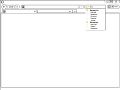
Sketches
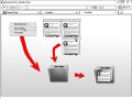
Adding bookmarks
Moving/Opening bookmarks
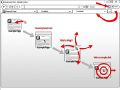
Example for grouping
bookmarks in folders
Folder expansion via zoom
(optional "fit-to-screen" zoom
on double click)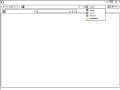
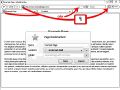
Selection of searching
in bookmarks instead the net
Selected 'bookmarks' (Lesezeichen)
Auto-complete example


User tests
- How did you test your design?
We tested our design using paper prototypes, as it is a fast, simple and reliable method of testing. One can instantly note where a test user struggles or has no problem at all and changing a mistake in the prototype is a matter of mere minutes. We sat three everyday tasks for our users: (a) to create bookmark for the page they were on, (b) to find their way to the Bookmark Wall and to arrange the existing bookmarks as they saw fit and (c) to create a new folder on the Wall and fill it with bookmarks.
- What new problems did you identify?
Overall, the tested users coped very well with the tasks and had no problems with the creation of new bookmarks or new folders on the Bookmark Wall. They intuitively used the bookmark symbol in the toolbar/adressbar to set the bookmark and created new folders by right-clicking on the Wall and choosing the “New Folder” option in the following menu. The most problems occurred in the second task: arranging the bookmarks. Every tested user had trouble to identify the bar that popped up on a mouse-over as the haptic surface on the bookmark. Instead of gripping the bar to drag and drop a bookmark around the Wall, the users always clicked directly on the bookmark, therefore opening it in a new tab. It also emerged the issue of how to mark multiple bookmarks at once and drag them into a folder or around.
- What did you change following your user tests?
We are currently working on that.