We thank our Mentors for their very helpful comments and based on their suggestions tried our best to correct and improve our site ^-^
11-03-17
Concept
- Which problem did you identify?
Based on our research on the use of bookmarks, we decided to revise the concept of how users organize and structure them. In interviews with other students who are quite experienced in browsing and friends and family members who only casually move through the internet, we came to the conclusion, based on our results, that most users only utilize the very basic functions provided by the bookmark system as it is today. They set a bookmark and then forget about it or have to search through all the accumulated bookmarks. Only a few people manage their bookmarks in folders. Websites that are not visited regularly often don't even deserve a bookmark and some users even prefer to search the internet again for a specific link, rather than to search through all of their bookmarks. We tried to find a way, to make the organizing and re-finding of bookmarks easier for the user.
- Why are current systems unable to solve this problem?
The current bookmark system of the Mozilla Browser is unable to handle this problem because it is to elaborate for most users. Even if it is easy to structure something with the folder hierarchy, it just takes too much effort. Not to forget how easily and quickly a bookmark can slip through the cracks, never to be seen again in a 10+ folder structure. Creation of a new folder and the editing of a bookmark itself take time. Users want the creation process and general managing of the bookmark system to be fast and simple, without much editing or maintenance on their side.
- What research findings led you to your first concept?
Through our research we found out that our test-persons use their bookmarks only for sites they visit regularly and then the bookmarks would most likely be placed in the toolbar, where their position and icon helps to rapidly recognize and open the desired page. That shows us that the positioning and appearance- even as an icon- of a bookmark means more to users than a name or some Meta information they have to laboriously edit and supply.
- In 140 characters, what is the essence of your project/solution?
Our goal is to make organizing bookmarks easier and more effective by introducing a visual, desktop-like display, using drag & drop for grouping/positioning.
- Prototype:
<flash>file=Designforaction_lauraj_bmanimation.swf|width=700|height=600</flash>

Implementation
- How did you ensure that a beginner can use your solution?
We want to use a visual, desktop-like display that users are already familiar with. Everyone that works with a computer knows how to organize and move folders and other things on their desktop around. The creation of a bookmark doesn’t really change that much, the user merely saves the bookmark to the Bookmark Wall and can, if he wants to, choose a folder to save it in. To position it on the Wall he can simply drag it around or drop it into a folder. Through the use of a zoom-function inside of the folders we try to give the user more space so they don’t need to limit themselves to just 100 bookmarks or so. If the space capacity of a folder is maxed out but the user still wants to add more bookmarks, the previews will become smaller and more list-like to accommodate the new bookmarks.
- What makes your solution more useful or efficient than current products?
Our solution is more efficient and useful for users because our concept works mainly with visual representations of bookmarks which users are able to identify and recognize effortlessly and swiftly. They can find bookmarks more efficiently through their position and appearance than just through a name, edited or not. We try to motivate and encourage even the users, who don't fanatically organize and maintain their stuff because it is to slow and arduous a task, to use the bookmark system. It is easier for them to organize their bookmarks using their own system and structure with a more visual and graphical representation of the whole bookmark system.
User Research
Results
- there is a clear separation of frequently used pages and the “treasure trove”: the habits of the user decide if they are stored in files with a command structure or not
- frequently used pages are seldom expanded and liable to a static hierarchy, therefore they have a fixed position and an easily recognizable icon
- the bookmarks in the treasure trove are sometimes renamed to fit the user, but mostly not bothered with
- users which are very familiar with the existing bookmarks system are unsure of and even fear the changes the system could undergo, because their usual system of recognition and memorization of bookmarks could become unsuitable
- bookmarks are mostly only edited if they’re used frequently, otherwise it’s not worth the bother
- easy synchronization between different devices should be possible as some users tend to use their bookmarks on more than one device: the new visual implementation should be able to be viewed with different resolutions
- the user wants to categorize and file their bookmarks fast and without much effort
- it’s important that they don’t have to dedicate much time to create a bookmark and everything stays cleanly arranged
- if there are no Bookmarks, instead of entering known URLs into the address-bar, they are typed into the search-engine-bar and let google make a clickable link out of it
- characteristic recognitions of webpages (related to the possibility of using screenshots) are coloring, position of the navigation, logo and funtionality
- bookmarks don't replace the search-engine, i.e. known and arranged sites are still googled first
Goals
- making the bookmark system more attractive by means of a visual wall-like display => Tab Candy, respectively Panorama on Firefox4 seems to (will) be a good advancement, maybe the idea of an extra bookmark searching field should be integrated, BUT see non-goals!
- users that are familiar with the existing system should still be able to use the modified version without the loss of their structure or a loss of quality
- the user should be able to visit frequently used webpages without detours and less important pages should be found more easily
- users should be able to quickly retrieve their bookmarks (with the use of logical search criteria)
- the file system should be retained so the user doesn’t have to adjust to a too new system
- more significant design in the browser (extra searching field)
- additional information like in the browser history (time, last visit, ...)
Non-Goals
- a completely new bookmarks system that nobody understands and everyone has to learn anew
- developing a Tab-Candy clone as bookmarks are NOT tabs
- making the graphic interface too unmanageable or cluttered
- removing the individual decisions for categorization or structuring
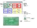
Sketches
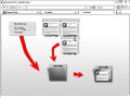
Adding bookmarks
Moving/Opening bookmarks
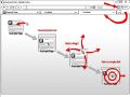
Example for grouping
bookmarks in folders
Folder expansion via zoom
(optional "fit-to-screen"
zoom on double click)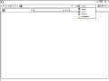
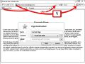
Selection of searching in
bookmarks instead the net
Selected 'bookmarks'
(Lesezeichen)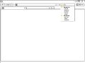
Auto-complete example


User tests
- How did you test your design?
We tested our design using paper prototypes, as it is a fast, simple and reliable method of testing. One can instantly note where a test user struggles or has no problem at all and changing a mistake in the prototype is a matter of mere minutes. We sat three everyday tasks for our users: (a) to create bookmark for the page they were on, (b) to find their way to the Bookmark Wall and to arrange the existing bookmarks as they saw fit and (c) to create a new folder on the Wall and fill it with bookmarks. We tested our prototypes on 5 persons, each with a time limit of 10 minutes but in every case the tested users only needed 5-7 minutes. Our test-persons were media art and media system students.
- What new problems did you identify?
Overall, the tested users coped very well with the tasks and had no problems with the creation of new bookmarks or new folders on the Bookmark Wall. They intuitively used the bookmark symbol in the toolbar/adressbar to set the bookmark and created new folders by right-clicking on the Wall and choosing the “New Folder” option in the following menu. The most problems occurred in the second task: arranging the bookmarks. Every tested user had trouble to identify the bar that popped up on a mouse-over as the haptic surface on the bookmark. Instead of gripping the bar to drag and drop a bookmark around the Wall, the users always clicked directly on the bookmark, therefore opening it in a new tab. It also emerged the issue of how to mark multiple bookmarks at once and drag them into a folder or around.
- What did you change following your user tests?
We changed the drag & drop process slightly and instead of using a bar as haptic surface to drag the bookmarks around with, they can now be dragged with a click, like folders on a desktop. To mark multiple bookmarks at once the user can now use the same method as on a desktop as well. Additionally, expanding folders and therefore having more space available is controlled through zooming into the folder.
Alternative Concept
- In 140 characters, what is the essence of your project/solution?
Our goal is to make organizing bookmarks more easy and effective by using a visual, desktop-like display, using colored/textured areas that are build in a grid structure.
Implementation
- How did you ensure that a beginner can use your solution?
Again, we want to use a desktop-like surface that users are familiar with. Unlike our first concept, you save your bookmarks to an area you built before and can’t drag your bookmarks around the whole surface, only in the chosen area. To set a bookmark the user just drags their tab into the little marked area on the bottom of their site, which can also be hidden. This marked area is also the access point for the user to zoom directly into the bookmark area. To prevent a never ending search for specific bookmarks in the system, we use the browser search bar and modify it so that you can search your bookmarks and not only search engines. Additionally, there is an icon bar to the side, where the most used bookmarks are set with only an icon. To avoid an overwhelmingly cluttered display, area names and the number of subareas are only displayed shortly while hovering the mouse over an area. The zoom is controlled with "+" and "-" which is familiar and easily comprehensible for the user.
Sketches
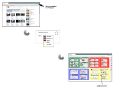
New area


User tests
- How did you test your design?
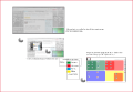
We like change, so we used an Illustrator prototype this tme.
- What new problems did you identify?
As with our first concept, we gave the test users everyday tasks: a) to create and name a new area and b) to save the current page as a bookmark in that area and to open that bookmark. There were some problems with the first task but not with the second. Instead of using the right-click right away to create a new area, they tried to find a button or draw a frame for it, as right-clicking in a browser was already occupied with other things in their mind. Some of the test users also found the aero-like effect bothersome and distracting because it covers, even if only for a short time, a whole area. We tested our prototypes on 5 persons, each with a time limit of 10 minutes but in every case the tested users only needed 5-7 minutes. Our test-persons were media art and media system students.
Mentor Comments
James Kalbach
Concept
- Your problem statement includes many aspects: using advanced features, organizing bookmarks in folders, and re-finding bookmarks. I’d prefer a clearer focus and statement around the issue you’re really trying to address.
- Some specific examples or comparison to existing systems would help here. You just mention “the current bookmark system.” Which system? What do they have in common? Do any existing systems have strengths perhaps?
- What type of research did you conduct initially and with whom? You say “most users,” which suggests some kind of quantification and generalization across a larger population. Unless you did a broader survey, you shouldn’t make such generalizations in this way. It seems you make more of an assumption, which is fine—but you should also express that way: “we assume many users typically have the problem of…”
- The first sentence of your project essence is good, but the rest of it goes over the 140 character limit.
Implementation
- Drag and drop is fine, but have you considered accessibility issues? A visually impaired user might not be able to use your system.
- Is there a limit to how many items a typical user can view and move around visually? For instance, I have hundreds of bookmarks.
- The search through bookmarks is a very good idea and something browsers should already offer.
- The zoom feature seems quite nice, but do you offer an alternative view of bookmarks? Sometimes a plain list works better than a spatial arrangement, and users may be seeking that.
- What alternative directions did you explore before arriving at this solution?
User tests
- Please describe more about the tests you conducted: with whom? How many people? How long was each session? What were your key findings?
Overall, it's clear you put a lot of thought into this. You've reacted to user feedback appropriately in your revisions. The immediacy of the visual approach to organizing bookmarks is a good thing and something to explore, but it also brings with it potential problems, such as accessibility or users' preference for an alternative ways to organize them.
Nice work.
Cennydd Bowles
I think there are some good concepts here and the changes you've made are well-considered responses to your findings. You identify a couple of major points in your research, namely that current approaches are too complex and managing folders is painstaking. The problem with this astute analysis is now you have to be sure your solution demonstrably solves those problems! I'm not sure it does yet, although with more iteration I'm sure you'd find further efficiencies.
Drag and drop is definitely a familiar and direct interaction, but Jim is right to point out that there are some accessibility concerns, related to both visual and motor skills. Would your solution work well with different input devices? e.g. a trackpad or even a keyboard, as opposed to a mouse?
Visual/spatial metaphors sometimes don't scale well. Your zoom control is obviously an attempt to counter this problem, but do you think there would come a point (eg zoom level, total number of bookmarks or folders) at which the system would have to change more significantly to work at large numbers? For instance, how might you help users to lay out large numbers of bookmarks in order to sift through them?
Your testing methods seem very sensible, and I absolutely applaud your choice of two different prototyping methods. I think your decision to drop the 'grab bar' was sensible, although I can absolutely understand why you added it. I think it's one of those cases where convention (the OS and desktop, in this case) has to rule over a "more correct" solution.
Eric Reiss
In practical terms, I think Cennydd and Jim have summarized the issues related to this project very well. That said, I don't think you folks have received enough praise for having done more detailed research at all. I think you DID uncover the key problems and made great strides to improve the process, even though your interview methodology and other background information regarding your research is lacking.
Although I agree with Jim when he says that you take for granted that the reader of your proposal understands various terms and techniques, I generally understood what you meant (although a venture capitalist would probably not). And Cennydd is right in pointing out the scalability issues, which I think may be the most serious drawback; I'd like to see if this system can scale to 500+ bookmarks.
But despite these shortcomings, let me be honest, this was one of the projects I liked best. Well done!