(changed links) |
|||
| Line 3: | Line 3: | ||
== PARAMETRIC LETTER == | == PARAMETRIC LETTER == | ||
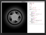
For the first homework I created the capital letter R in Processing 3 <br> and named my variables by the | For the first homework I created the capital letter R in Processing 3 <br> and named my variables by the [http://typedia.com/learn/only/anatomy-of-a-typeface/ Anatomy of Typeface]. <br> | ||
Code can be viewed on | Code can be viewed on [http://www.openprocessing.org/sketch/226645 OpenProcessing] <br> | ||
== ANIMATED LETTER == | == ANIMATED LETTER == | ||
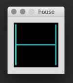
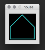
Simple H, animated with the Ani library, that turns into a house, <br> when you press the mouse and will be destroyed when you press the key 'd'. <br> | Simple H, animated with the Ani library, that turns into a house, <br> when you press the mouse and will be destroyed when you press the key 'd'. <br> | ||
Code can be viewed on | Code can be viewed on [http://www.openprocessing.org/sketch/247518 OpenProcessing] <br> | ||
[[Image:house_1.png|thumb|left|150px]] | [[Image:house_1.png|thumb|left|150px]] | ||
Revision as of 14:51, 17 December 2015
This is the »Wild Type« page of — Jessica Hüttig
PARAMETRIC LETTER
For the first homework I created the capital letter R in Processing 3
and named my variables by the Anatomy of Typeface.
Code can be viewed on OpenProcessing
ANIMATED LETTER
Simple H, animated with the Ani library, that turns into a house,
when you press the mouse and will be destroyed when you press the key 'd'.
Code can be viewed on OpenProcessing
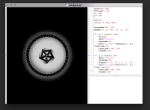
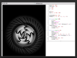
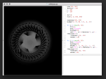
EXAMPLES CREATED WITH DRAWBOT
FICTIONAL ALPHABET
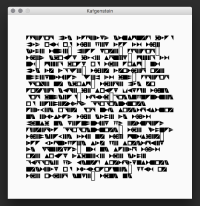
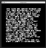
I created my fictional alphabet in RoboFont.
The idea was, to rotate every letter 90 degrees clockwise and to simplify them into filled geometric forms, like triangles and squares.
If the letter has a Counter, I tried to show this with a gap inside the geometric form or between two geometric forms of one letter.
I actually created only upper-case letters, but for the Kafgenstein-example in Processing, I used the same forms for the lower-case ones.
Otherwise you would only see the first character of a noun. Missing punctuation characters are displayed as an unfilled rectangles.
Take a look at the pretty pictures. ;)
