IFD:Nutzerstudien WiSe1314/HeuristicAnalysisSecurity Person6: Difference between revisions
No edit summary |
|||
| (7 intermediate revisions by one other user not shown) | |||
| Line 29: | Line 29: | ||
In my opinion there is no need for a undo / redo functionality in that kind of application. Everything is accessable and one could return to the former step / place by using the device return button. | In my opinion there is no need for a undo / redo functionality in that kind of application. Everything is accessable and one could return to the former step / place by using the device return button. | ||
<!-- Wieder das "accessable". Das Wort device würde ich streichen. Ansonsten einwandfrei. --> | |||
== Consistency and standards == | == Consistency and standards == | ||
| Line 35: | Line 37: | ||
# If you open up the context menu you will see an exit button at the bottom. In my opinion this should not be there. Instead this functionality should be provided by the home button. | # If you open up the context menu you will see an exit button at the bottom. In my opinion this should not be there. Instead this functionality should be provided by the home button. | ||
# The settings menu is hidden behind the three points. Today most mobile device users expect some kind of gear-wheel or screw-wrench. Maybe it would be better to change the three points into something like that. If the three points are a place-holder for an collection of options it should be more clear what is meant with this symbol. | # The settings menu is hidden behind the three points. Today most mobile device users expect some kind of gear-wheel or screw-wrench. Maybe it would be better to change the three points into something like that. If the three points are a place-holder for an collection of options it should be more clear what is meant with this symbol. | ||
<!-- # "This means" klingt unschön und ich weiß nicht, ob es das in eng. gibt, "so" sagt dasselbe. Was meinst du mit "marks", dass das ganze Chat-Fenster markiert im Sinne von "ausgewählt" worden ist? | |||
# Bitte Screenshot. Und was ist genau das Kontextmenü? Die "home"-Seite dann? | |||
# Einwandfrei. Passt auch alles in die Kategorie.--> | |||
== Error prevention == | == Error prevention == | ||
[add User] | [add User] | ||
#1 The explanation of the dialog says you should enter the email address of the person you would add. This could | #1 The explanation of the dialog says you should enter the email address of the person you would add. This could maybe confusing because people could think they could add all people with an email address. | ||
#2 If one accidentally touches the area outside the dialog box the process of adding a contact is stopped. The annoying point is that one has to type in the data again if you want to add the contact. | #2 If one accidentally touches the area outside the dialog box the process of adding a contact is stopped. The annoying point is that one has to type in the data again if you want to add the contact. | ||
| Line 45: | Line 54: | ||
The most complex part of ChatSecure is the setup process. But the user is well guided through. There is no need to remember things from former steps. Possible options are accessable through the settings menu. Features could there be turned on an off which is what a user expects. | The most complex part of ChatSecure is the setup process. But the user is well guided through. There is no need to remember things from former steps. Possible options are accessable through the settings menu. Features could there be turned on an off which is what a user expects. | ||
<!-- "There features could be turned on an off, which is what a user expects."--> | |||
== Flexibility and efficiency of use == | == Flexibility and efficiency of use == | ||
| Line 53: | Line 64: | ||
All dialogs and messages I have seen inside ChatSecure did exactly that they where designed for. There where some little problems with the description of the dialog but this are fine details. Extra information and settings, which the basic user does not need, are accessable via an extra menu. I am not that familiar with the Android Design Guidelines, but for me looked like it should on android. Also the interface is reduced to the minimal necessary elements which is also helpful for the user. | All dialogs and messages I have seen inside ChatSecure did exactly that they where designed for. There where some little problems with the description of the dialog but this are fine details. Extra information and settings, which the basic user does not need, are accessable via an extra menu. I am not that familiar with the Android Design Guidelines, but for me looked like it should on android. Also the interface is reduced to the minimal necessary elements which is also helpful for the user. | ||
<!-- "...did exactly what..." "for me it looked" "is also reduced" | |||
== Help users recognize, diagnose and recover from errors == | == Help users recognize, diagnose and recover from errors == | ||
For now I have not seen some error messages, but from former versions i remember some. There where all very technical and not saying. Details are fine if one knows how to deal with, but it would be better to give a description of the problem and add an detail Button to see the exact problem. | For now I have not seen some error messages, but from former versions i remember some. There where all very technical and not saying. Details are fine if one knows how to deal with, but it would be better to give a description of the problem and add an detail Button to see the exact problem. | ||
<!-- "They were...." "deal with them" "a detail button" | |||
== Help and documentation == | == Help and documentation == | ||
A detailed or even basic help is missing for now. In my opinion it would be nice to have a short tutorial explaining the background for the user. This should easily explain what is OTR, what is a fingerprint and maybe some reasons why one should use the encryption. It could also ne nice to have a short Q/A part where some basic questions like 'Where did i find ...' or 'Is this possible ...' are answered. | A detailed or even basic help is missing for now. In my opinion it would be nice to have a short tutorial explaining the background for the user. This should easily explain what is OTR, what is a fingerprint and maybe some reasons why one should use the encryption. It could also ne nice to have a short Q/A part where some basic questions like 'Where did i find ...' or 'Is this possible ...' are answered. | ||
<!-- "be nice"--> | |||
== Bugs == | == Bugs == | ||
| Line 74: | Line 91: | ||
* [chat window] | * [chat window] | ||
Chat partner is shown as offline even if he is online. | Chat partner is shown as offline even if he is online. | ||
<!-- Würde ich ales zu "consistency and standard" stecken. --> | |||
Latest revision as of 14:00, 23 January 2014
Aufgaben:
- Neuen Kontakt hinzufügen
- Nachricht verschicken auf den Wegen:
- Unsicher
- Verschlüsselt
- Authentifiziert
Beachtet
- Jedes Mitglied der Gruppe macht die Analyse für die Themenfelder der Gruppe (s.o.) selber (= keine Zusammenarbeit), da jede Person andere Fehler findet, sodass sich die Analysen ergänzen.
- Bitte so dokumentieren, dass die Analyse und ihre Ergebnisse dem Lehrenden (Jan) und dem ChatSecure Team verständlich sind. Schreibt auf Englisch (wenn möglich, sonst Deutsch) und nutzt Screenshots oder Skizzen.
CHAT SECURE v 13.1.2
Visibility of system status
[start OTR] If the chat partner is online and an OTR chat should be started nothing happens. It would be better if there is a timeout, lets say 15-30 seconds and after that a error message is shown. Instead only the ring is circling and nothing happens.
=>OTR does not work at all.
Match between system and the real world
The interface 'speaks' the users language. This means today most people try using chat secure are familiar with that kind of application. ChatSecure doesn't make an exception, so it should be easy accessable.
User control and freedom
In my opinion there is no need for a undo / redo functionality in that kind of application. Everything is accessable and one could return to the former step / place by using the device return button.
Consistency and standards
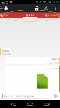
- Most elements inside ChatSecure are clickable. For example the status button or the current status message. The name of the chat partner is underlined. For the first time I have thought it is clickable and tried it. This means I expected a reaction on my click, like the other interface elements would do. Later a figured out that this marks the current chat-tab.
- If you open up the context menu you will see an exit button at the bottom. In my opinion this should not be there. Instead this functionality should be provided by the home button.
- The settings menu is hidden behind the three points. Today most mobile device users expect some kind of gear-wheel or screw-wrench. Maybe it would be better to change the three points into something like that. If the three points are a place-holder for an collection of options it should be more clear what is meant with this symbol.
Error prevention
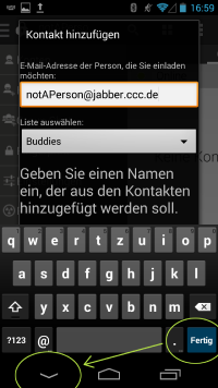
[add User]
- 1 The explanation of the dialog says you should enter the email address of the person you would add. This could maybe confusing because people could think they could add all people with an email address.
- 2 If one accidentally touches the area outside the dialog box the process of adding a contact is stopped. The annoying point is that one has to type in the data again if you want to add the contact.
Recognition rather than recall
The most complex part of ChatSecure is the setup process. But the user is well guided through. There is no need to remember things from former steps. Possible options are accessable through the settings menu. Features could there be turned on an off which is what a user expects.
Flexibility and efficiency of use
I don't know if accelerators are needed / existing inside ChatSecure. In my opinion there is no action which needs to repeat steps often.
Aesthetic and minimal design
All dialogs and messages I have seen inside ChatSecure did exactly that they where designed for. There where some little problems with the description of the dialog but this are fine details. Extra information and settings, which the basic user does not need, are accessable via an extra menu. I am not that familiar with the Android Design Guidelines, but for me looked like it should on android. Also the interface is reduced to the minimal necessary elements which is also helpful for the user.
Bugs
- [add User]
After typing the address with the keyboard the finish button does not work. You have to click an other Button below.

- [chat window]
- [chat window]
Chat partner is shown as offline even if he is online.
