(added some detail) |
(delete old version) |
||
| Line 3: | Line 3: | ||
As you can see in my previous assignments for this class, I like geometric shapes and simple, but handsome Typography. <br> So for the first part of my final project, I created a font named ''Harsh Type'' in RoboFont, because I’m quite familiar with this tool and it is advantageous <br> for creating glyphs that are consisting of geometric shapes. In my font, the common shape of the Latin alphabet should be retained, but become transformed or interpreted in a new way. I am a fan of Capitals, but for the sake of completeness I also created the lower-case letters, <br> numbers and basic punctuation. The lower-case letters belong to similar guidelines, which I defined for the the upper-case ones. <br> | As you can see in my previous assignments for this class, I like geometric shapes and simple, but handsome Typography. <br> So for the first part of my final project, I created a font named ''Harsh Type'' in RoboFont, because I’m quite familiar with this tool and it is advantageous <br> for creating glyphs that are consisting of geometric shapes. In my font, the common shape of the Latin alphabet should be retained, but become transformed or interpreted in a new way. I am a fan of Capitals, but for the sake of completeness I also created the lower-case letters, <br> numbers and basic punctuation. The lower-case letters belong to similar guidelines, which I defined for the the upper-case ones. <br> | ||
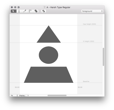
My font is generally based on the three forms of the Bauhaus – triangle, rectangle or square and the circle. <br> If a letter has a [http://typedia.com/learn/article/counter/ Counter], it is shown as a circle. <br> If the Counter is open, like in case of a C, the glyph is predominantly circular shaped. <br>There are existing a few variations, because these two guidelines are also depending to my sense of aesthetic. | |||
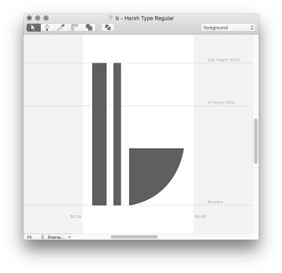
The lower-case letters are characterized with a second [http://typedia.com/learn/article/stem/ Stem], so they seems more fragil than the Capitals. <br> I had no specific guidelines for the numbers, but they should only consist of rectangles and circles. <br> So I experimented, what would might look nice. <br> | The lower-case letters are characterized with a second [http://typedia.com/learn/article/stem/ Stem], so they seems more fragil than the Capitals. <br> I had no specific guidelines for the numbers, but they should only consist of rectangles and circles. <br> So I experimented, what would might look nice. <br> | ||
Additionally I created some basic punctuation, like a dot, a comma and a semicolon. | Additionally I created some basic punctuation, like a dot, a comma and a semicolon. | ||
Revision as of 15:11, 25 July 2016
HARSH TYPE PARTICLE
As you can see in my previous assignments for this class, I like geometric shapes and simple, but handsome Typography.
So for the first part of my final project, I created a font named Harsh Type in RoboFont, because I’m quite familiar with this tool and it is advantageous
for creating glyphs that are consisting of geometric shapes. In my font, the common shape of the Latin alphabet should be retained, but become transformed or interpreted in a new way. I am a fan of Capitals, but for the sake of completeness I also created the lower-case letters,
numbers and basic punctuation. The lower-case letters belong to similar guidelines, which I defined for the the upper-case ones.
My font is generally based on the three forms of the Bauhaus – triangle, rectangle or square and the circle.
If a letter has a Counter, it is shown as a circle.
If the Counter is open, like in case of a C, the glyph is predominantly circular shaped.
There are existing a few variations, because these two guidelines are also depending to my sense of aesthetic.
The lower-case letters are characterized with a second Stem, so they seems more fragil than the Capitals.
I had no specific guidelines for the numbers, but they should only consist of rectangles and circles.
So I experimented, what would might look nice.
Additionally I created some basic punctuation, like a dot, a comma and a semicolon.
As you can see in the following screenshots, the Cap Height amounts 500 and the X Height amounts 350.
The stemheight of lower-case letters also amounts 500 like the Cap Height.
The Counter of them amounts 350, like the X Height.
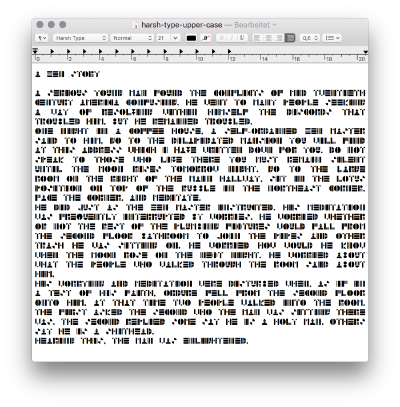
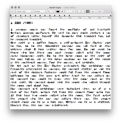
In the following two screenshots, I visualized my font. In the first one, I only used Capitals and in the second one, I used upper- and lower-case letters.
For the second part of my final project, I wanted to create a 3D-version of my font.
When we talked about this in the idea-presentation, I said I would do this in Blender, but I've changed my mind.
At first, I tried some stuff with Hemesh, but this was an overkill for my programming skills and not necessary for the execution of my idea.
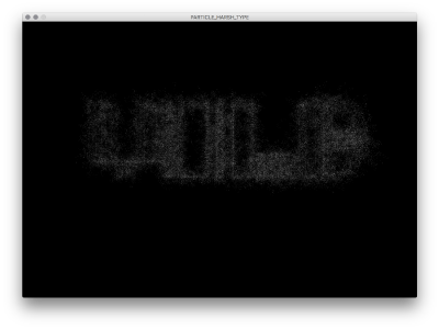
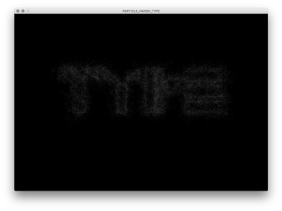
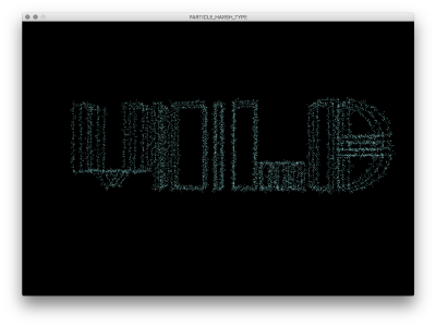
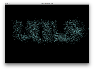
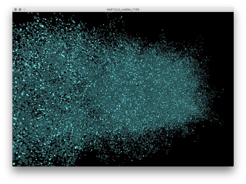
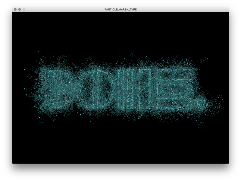
I've decided to turn my font in a 3D-particle version and experiment with this.
So my sketch creates a 3D-shaped text of an imported font. Each point of the contour is represented as a sphere. On these points, trails of spheres are emerging with a changeable value of the distance of their starting point. If you press the mouse, each sphere returns the trail back to it's origin of the font-contour.
You can type letter, numbers or punctuation in the run-mode.
By deleting a glyph in the run-mode, I got a NullPointerException. So, a dot instead of a blank disappears.
A little preview of my particle font:
I uploaded a few videos of displaying the glyphs in 3D, because it's easier than hundreds of screenshots.
Take a look at the upper-case-letters
Take a look at the lower-case-letters
Take a look at the numbers
Then I experimented with the size of the spheres and because of their structure, the innards of the font look quite interesting.
Take a look at this here.
A nice feature is the variable traillength and jump-distance of each particle to it's starting point in the contour.
By increasing these two values, the font becomes more illegible, as you can see here and here.
Additionally an interesting tangle of spheres emerges, as you can see here.
It seems, the glyphs are disappearing in their own shapes.
If you want to retract them, just hold your mouse pressed.
You can also let the text wander through the space by changing the direction of the particles, for example on the x-axis.
Last words:
This sketch is killing my video card, but if have a better one, you can increase the detail of the spheres and type more text.
Download the code, the .ttf and .ufo files here.
But for now, I'm –
